Topics
Microeconomic Theory
Microeconomics and Macroeconomics: Introduction
Theory of Income and Employment
Demand and Law of Demand
- Role of Demand and Supply in Economics
- Paul A. Samuelson: Father of Modern Economics
- Concept of Demand
- Types of Demand
- Determinants of Demand
- Demand Function
- Law of Demand
- Demand Schedule
- Individual Demand Schedule
- Market Demand Schedule
- Demand Curve
- Individual Demand Curve
- Market Demand Curve
- Reasons for the Downward Slope of the Demand Curve
- Importance of the Law of Demand
- Exceptions to the Law of Demand
- Movement along the Demand Curve and Shift of the Demand Curve
- Change in Quantity Demanded: Movement along the Demand Curve
- Change in Demand – Shift in Demand Curve
- Difference Between Extension and Increase in Demand
- Difference Between Contraction and Decrease in Demand
Theory of Consumer Behaviour: Marginal Utility and Indifference Curve Analysis
- Basic Concepts of Microeconomics > Utility
- Cardinal Approach (Utility Analysis)
- Total Utility and Marginal Utility
- Relationship Between Total Utility and Marginal Utility
- Approaches to Consumer Behaviour
- Law of Diminishing Marginal Utility
- Alfred Marshall: Key Contributor to Economics
- Consumer's Equilibrium through Cardinal Utility Approach
- Law of Equi-Marginal Utility
- Importance and Limitations of law of Equi-Marginal Utility
- Ordinal Utility Analysis/Indifference Curve Analysis
- Marginal Rate of Substitution (MRS)
- Relationship Between Marginal Rate of Substitution and Marginal Utility
- Properties of Indifference Curves
- Price Line or Budget Line
- Consumer's Equilibrium through Indifference Curve Approach
Money and Banking
Elasticity of Demand
- Concept of Elasticity of Demand
- Types of Elasticity of Demand > Price Elasticity
- Methods of Measuring Price Elasticity of Demand
- Percentage or Proportionate Method
- Total Expenditure Method
- Point Method (Geometric Method)
- Arc Elasticity of Demand
- Revenue Method
- Numerical Problems of Price Elasticity of Demand
- Factors Affecting Price Elasticity of Demand
- Importance of Elasticity of Demand
- Types of Elasticity of Demand > Income Elasticity
- Types of Elasticity of Demand > Cross Elasticity
Balance of Payment and Exchange Rate
Supply: Law of Supply and Price Elasticity of Supply
- Concept of Supply
- Determinants of Supply
- Law of Supply
- Movements Along and Shifts in Supply Curve
- Elasticity of Supply
- Price Elasticity of Supply
- Categories (Degrees) of Elasticity of Supply
- Measurement of Elasticity of Supply > Percentage Method
- Measurement of Elasticity of Supply > Geometric or Point Method
- Determinants of Elasticity of Supply
Public Finance
Market Mechanism: Equilibrium Price and Quantity in a Competitive Market
- Basic Concepts of Equilibrium and Equilibrium Price
- Equilibrium Price and Quantity in a Competitive Market
- Effects of Changes (Shifts) in Demand on Equilibrium Price and Equilibrium Quantity
- Effects of Changes (Shifts) in Supply on Equilibrium Price and Equilibrium Quantity
- Effects of Simultaneous Changes (Shifts) in Demand and Supply
- Some Special Cases of Equilibrium
- Applications of Tools of Demand and Supply Price Control
- Mаximum Price Legislation or Price Ceiling and Rationing
- Minimum Price Legislation or Floor Price
National Income
Laws of Returns: Returns to a Factor and Returns to Scale
- Basics of Production Theory
- Products
- Factors of Production
- Production Function
- Types of Production Functions
- Basic Product Concepts
- Relationship between Average Product (AP) and Marginal Product (MP)
- Relationship between Total Product (TP) and Marginal Product (MP)
- Law of Variable Proportions
- Three Stages of Production
- Stages of Operation and the Decision to Produce
- Variation of Output in the Short-Run Returns to a Factor
- Changes in Production
- Explanation of the Law of Variable Proportions
- Variation of Output in the Long Run - Returns to Scale
- Law of Variable Proportions and Returns to Scale Compared
- Scale of Production and Concept of Indivisibility
- Economies of Scale
- Diseconomies of Scale
- Significance of Economies of Scale
Cost and Revenue Analysis
- Cost of Production
- Theories of Costs: Traditional Theory of Costs/Short Run Cost Curves
- Cost Concepts > Total Costs
- Cost Concepts > Average Cost
- Cost Concepts > Marginal Cost
- Costs in Long Run Period
- Difference Between Short - Run & Long Run Costs
- Behaviour of Cost in the Short - Run
- Relationship between Average and Marginal Cost
- Long-Run Cost Curves
- Revenue Concepts
- Types of Revenue
- Relation Between Total, Average and Marginal Revenue
- Relationship between Total, Average and Marginal Revenues under Perfect Competition
- Relationship between Total, Average and Marginal Revenue under Imperfect Competition
- Relationship Between (Mutual Determination) AR, MR, and Elasticity of Demand
- Comparative Study of Revenue Curves under Different Markets
- Significance of Revenue Curve
Forms of Market
- Concept of Market
- Market Structure
- Classification of Market Structure
- Perfect Competition
- Monopoly
- Monopolistic Competition
- Oligopoly
- Duopoly
- Bilateral Monopoly
- Concept of Monopsony
- Other Forms of Market
- Factors Determining Market / Extent of Market
- Demand Curves of Firms under Different Market Forms
- Comparison between different forms of market
Producer's Equilibrium
Equilibrium of Firm and Industry Under Perfect Competition
- Concept of Equilibrium in Economics
- Firm's Equilibrium
- Producer's (Firm's) Equilibrium: Total Revenue and Total Cost Approach
- Producer's (Firm's) Equilibrium: Marginal Revenue and Marginal Cost Approach
- Determination of Short Run Equilibrium of a Firm
- Firm is a Price Taker, Not a Price Maker
- Determination of Long Run Equilibrium of a Firm
- Equilibrium of Industry
- Difference Between Firm and Industry's Equilibrium
Producer's Equilibrium Under Perfect Competition
Determination of Equilibrium Price and Output Under Perfect Competition
- Perfect Competition
- Price Determination Under Perfect Competition
- Changes in Equilibrium
- Effects of Changes (Shifts) in Demand on Equilibrium Price and Equilibrium Quantity
- Time Element in the Theory of Price Determination
- Determination of Equilibrium Prices
- Normal Price and Law of Returns
- Comparison between Market Price and Normal Price
- Practical Applications of Tools of Demand and Supply Analysis
- Determination of Short Run Equilibrium of a Firm
- Determination of Long Run Equilibrium of a Firm
Price Output Determination Under Monopoly
Price Output Determination Under Monopolistic Competition and Oligopoly
- Imperfect Competition
- Monopolistic Competition
- Equilibrium Price and Output under Monopolistic Competition
- Group Equilibrium in Monopolistic Competition
- Product Differentiation
- Selling Costs
- Oligopoly
- Price and Output Determination under Oligopoly
- Price Rigidity-Sweezy's Kinky Demand Curve Model or Equilibrium under Independent Action
- Cournot's Model
- Collusive Oligopoly
- Mergers
Theory of Income and Employment
- Basic Model of Income Determination
- Aggregate Demand and Its Components
- Propensity to Consume or Consumption Function
- Propensity to Save
- Investment Expenditure
- Determination of Equilibrium Income and Output
- Saving-investment Approach
- Investment Multiplier and Its Mechanism
- Solved Problems on Consumption and Income
- The Concept of Full Employment
- Important Terms of Employment and Unemployment
- Excess Demand
- Deficient Demand
Basic Concepts of Macro Economics
Aggregate Demand and Supply-Determinants of Equilibrium
Consumption Function (Propensity to Consume)
- Propensity to Consume or Consumption Function
- Kinds or Technical Attributes of Propensity to Consume > Average Propensity to Consume
- Kinds or Technical Attributes of Propensity to Consume > Marginal Propensity to Consume
- Propensity to Save
- Determinants of Propensity to Consume
- Psychological Law of Propensity to Consume
- Measures to Raise Propensity to Consume
Concept of Investments-Types and Determinants
Multiplier - I : Static and Dynamic
Full Employment and Voluntary Unemployment
Problems of Deficient Demand and Excess Demand
Measures to Correct Deficient and Excess Demand
Money: Meaning and Functions
Banks: Commercial Bank and Central Bank
- Concept of Bank
- Types of Bank
- Commercial Banks
- Banking > Functions of Commercial Bank
- Credit Creation by Commercial Banks
- Role of Commercial Banks in an Economy
- Central Bank
- Comparison Between Central Bank and Commercial Banks
- Central Bank as a Controller of Credit
- Methods of Credit Control
- Quantitative Methods
- Qualitative (Or Selective) Methods
Balance of Payment and Exchange Rate
- Concept of Balance of Payments
- Features of Balance of Payment
- Balance of Trade and Balance of Payments- Comparison
- Structure of Balance of Payment
- Methods to Measure Balance of Payments
- Components of Balance of Payments
- Current Account Transactions
- Capital Account Transactions
- Balance of Payments Always Balances
- Categories of Balance of Payments
- Balance of Payments Disequilibrium
- Measures to Correct Disequilibrium in the Balance of Payments
- Foreign Exchange Rate
- Exchange Rate
- Types of Foreign Exchange Rate
- Fixed Rate of Exchange
- Flexible Rate of Exchange
- Managed Floating Exchange Rate System
- Determination of Equilibrium Rate of Exchange
- Factors or Determinants of Foreign Exchange Rate
- Concepts of Depreciation, Appreciation, Devaluation and Revaluation
- Determination of Exchange Rate in a Free Market
Fiscal Policy
- Structure of Public Finance > Fiscal Policy
- Public Finance
- Instruments of Fiscal Policy
- Objectives of Fiscal Policy
- Miscellaneous Objectives of Fiscal Policy
- Fiscal Measures for Stabilisation
- Methods of Fiscal Policy in Developing Countries
- Limitations of Fiscal Policy
- Structure of Public Finance > Public Revenue
- Instruments of Fiscal Policy - Taxation
- Types of Taxes
- Tax Reforms in India
- Proportional, Progressive and Regressive Taxes
- Structure of Public Finance > Public Expenditure
- Importance of Public Expenditure
- Structure of Public Finance > Public Debt
- Reasons for Borrowing by the Government
- Public Debt - Redemption
- Deficit Financing
- Fiscal Policy in Action
Government Budget
- Budget
- Types of Budget
- Government Budget
- Need and Importance of Government Budget
- Types of Government Budget in India
- Components (Structure) of the Government Budget
- Modern Classification of Budget
- Classification of Budget Receipts
- Balanced Budget Vs Unbalanced Budget
- Zero-Base Budgeting (ZBB)
- Zero-Base Budgeting in India
- Concepts Related to Budget Deficits
- Constituents of budget /Structure of the budget
- Structure of Public Finance > Public Expenditure
- Revenue Expenditure and Capital Expenditure
- Developmental and Non-developmental Expenditure
- Tax Revenue
- Public Revenue > Non-tax Revenue
- Capital Receipts
- Objectives of Budget
- Significance of Budget
- Types of budget deficit
- Budgetary Procedure
National Income and Circular Flow of Income
- Concept of National Income
- Domestic Income
- National Income Aggregates
- Significance or Importance of National Income
- Circular Flow of Income
- Circular Flow in a Closed Economy
- Circular flow and the Equality between Production, Income and Expenditure
- Circular Flow in a Open Economy
- Economic Sectors of an Economy
- Two-Sector Model without Savings and Investment
- Two-Sector Model with Savings and Investment
- Three-Sector Model of Circular Flow of Income
- Four-Sector Model of Circular Flow of Income
- Significance or Importance of Circular Flow of Income
National Income Aggregates
- Key Relationships Among National Income Aggregates
- National Income Aggregates
- Gross Domestic Product at Market Price
- Gross National Product at Market Price
- Constituents of GNP
- Net Domestic Product at Market Price
- Difference between Net Domestic and Net National Product at Market Price
- Net National Product (NNP)
- Difference between Net National and Gross National Product at Market Price
- Net National Income or Product at Factor Cost
- Net Domestic Product or Income at Factor Cost
- Difference between Net Domestic Product at Factor Cost and Net Domestic Product at Market Price
- Gross Domestic Product or Income at Factor Cost
- Gross National Product at Factor Cost
- Factor Income from Net Domestic Product accuring to Private Sector
- Private Income
- Difference between National and Private Income
- Personal Income of National Income
- Difference between Private and Personal Income
- Disposable Income Aggregates
- Per Capita Income
- Real Income
- Interrelationship among National Income Aggregates
- Real GDP and Nominal GDP
- Gross Domestic Product (National Income) and Economic Welfare
Methods of Measuring National Income
- Concept of National Income
- Methods of Measurement of National Income
- Net Product or Value Added Method
- Precautions in the Estimation of National Income by Value-added Method
- Difficulties in the Estimation of National Income by Value-added Method
- Income Method
- Expenditure Method
- Precautions in the Estimation of National Income by Expenditure Method
- Alternative Methods of National Income Estimation
- Reconciling The Three Methods Of Estimating National Income
- Components of Net National Product at Factor Cost in its Three Phases
- Transactions Included in National Income
- The Identity of Output, Income and Expenditure
- Significance of three Methods
- Transactions not Included in National Income
- Numericals on Income, Product and Expenditure Method
National Income and Economic Welfare
- Welfare Economics
- Definitions of Welfare Economics
- Factors Determining the Size of National Income
- National Income and National Welfare
- Relation between Economic Welfare and National Income
- National Income as a Measure of Economic Welfare
- Causes of Slow Growth of National Income
- Suggestions for Increasing National Income
- TR-TC Approach
- Behaviour of TR and TC
- Loss region, break‑even points and profit region
- Maximum profit and equilibrium output
- Total Profit (TP) curve and equilibrium
- Limitations of TR–TC method
- Real-Life Application
- Key Points: Producer's (Firm's) Equilibrium: Total Revenue and Total Cost Approach
CISCE: Class 12
TR–TC approach
- A producer is in equilibrium when the producer is earning the maximum possible profit and has no tendency to increase or decrease output.
- In the Total Revenue–Total Cost (TR–TC) approach, profit is:
Profit (π) = TR − TC - So, the firm is in equilibrium at that level of output where this difference (TR − TC) is positive and the largest.
CISCE: Class 12
Behaviour of TR and TC
Total Revenue (TR) curve
- Under perfect competition, the firm is a price taker and sells each unit at the same market price.
- Therefore, as output increases, TR increases at a constant rate and the TR curve is a straight line from the origin.
Short‑run Total Cost (TC) curve
- Even at zero output, the firm has to pay total fixed cost (e.g., rent, interest), so the TC curve starts from a point A above the origin.
- As output increases, total cost also increases:
Initially, at a decreasing rate (due to better use of fixed factors) → TC is concave downwards.
Later, at an increasing rate (due to diminishing returns) → TC becomes concave upwards.
CISCE: Class 12
Loss region, break‑even points and profit region
1] Loss region
- For outputs less than OL, the TC curve lies above TR, so TC > TR and the firm incurs losses equal to TC−TR.
- For outputs greater than ON, again TC > TR, so the firm has losses.
2] Break‑even points (no profit, no loss)
- At OL output, TR just equals TC at point B → first break‑even point (zero profit).
- At ON output, TR and TC meet again at point D → second break‑even point.
- At each break‑even point, TR = TC, so profit = 0.
3] Profit region (between OL and ON)
- For outputs between OL and ON, TR > TC, so the firm earns positive profits.
- However, the amount of profit changes with output depending on how wide the gap between TR and TC is.
Thus, the firm’s profitable range of output is from OL to ON.
CISCE: Class 12
Maximum profit and equilibrium output
As the firm raises output from OL towards ON, the vertical distance between TR and TC curves:
- Increases at first → profit rises.
- Becomes maximum at OM → profit is at its highest level.
- Then it shrinks beyond OM till it becomes zero at ON → profit falls to zero.
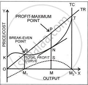
At OM output:
- The vertical distance CE between TR and TC is greatest, so profit is maximum.
- A tangent tt drawn at point R on the TC curve is parallel to the TR curve, meaning their slopes are equal.
- The slope of TR shows Marginal Revenue (MR) and slope of TC shows Marginal Cost (MC).
- Therefore, at OM, MR = MC, which is the standard condition for producer’s equilibrium.
Hence, OM is the equilibrium (profit‑maximising) level of output, and maximum profit is represented by CE (or GM on the TP curve).
CISCE: Class 12
Total Profit (TP) curve and equilibrium
- At each output level, profit is calculated as TR−TC.
- Plotting these profit values against output gives the Total Profit (TP) curve.
In the diagram:
- For outputs below OL and beyond ON, profit is negative, so TP lies below the X‑axis.
- At OL and ON, TP cuts the X‑axis, showing zero profit (break‑even outputs, point L and the corresponding point at ON).
- Between OL and ON, TP lies above the X‑axis and:
Rises from OL to OM, meaning profit is increasing.
Reaches a maximum at OM (point G).
Falls after OM, indicating falling profit.
Thus, the firm is in equilibrium at OM output, where the TP curve is at its highest point, and profit is maximum (segment GM).
CISCE: Class 12
Limitations of TR–TC method
- Hard to see exact maximum gap: It is not easy to locate exactly where the vertical distance between TR and TC is maximum just by looking at the diagram.
- Price per unit not shown directly: The diagram shows only totals (TR and TC), so price per unit is not visible, unlike in MR–MC diagrams where price = MR = AR can be read more easily under perfect competition.
CISCE: Class 12
Real-Life Application
- Consider a bakery selling cupcakes at a fixed price.
- As the bakery increases output from 0 to 10, 20, 30 cupcakes a day, its total revenue rises in a straight line, while total cost at first increases slowly and then faster.
- Initially, extra cupcakes add more to revenue than to cost, so profit rises.
- After a certain output (say 50 cupcakes), overtime wages, faster wear‑and‑tear, and extra inputs raise total cost quickly.
- Now, each additional cupcake adds more to cost than to revenue, so profit falls.
- The bakery’s best output is where profit is highest – that is its producer’s equilibrium according to the TR–TC approach.
CISCE: Class 12
Key Points: Producer’s (Firm’s) Equilibrium: Total Revenue and Total Cost Approach
- Producer’s equilibrium (TR–TC approach) is the level of output where profit (TR − TC) is maximum and any change in output reduces profit.
- Under perfect competition, TR is a straight‑line curve from the origin because price is constant.
- The short‑run TC curve starts above the origin due to fixed costs and is S‑shaped.
- Break‑even outputs occur where TR = TC (no profit, no loss) – points B (OL) and D (ON).
- The profit‑making range of output lies between OL and ON, where TR > TC.
- Equilibrium output OM is where the vertical distance between TR and TC is greatest and, equivalently, where MR = MC.
- The TP curve is maximum at equilibrium output and is negative outside the profitable range.
- The TR–TC method is intuitive but does not directly show price per unit and makes it difficult to eyeball the exact profit‑maximising output.
