Advertisements
Advertisements
Question
The two graphs below compare Car A and Car B. The left graph shows the relationship between age and value. The right graph shows the relationship between size and maximum speed.
 |
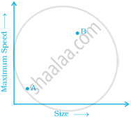 |
Use the graphs to determine whether each statement is true or false, and explain your answer.
- The older car is less valuable.
- The faster car is larger.
- The larger car is older.
- The faster car is older.
- The more valuable car is slower.
Advertisements
Solution
- False, the older car is 8 i.e. 8 valuable more than car A.
- True, in the second graph 8 is larger car having greater speed.
- True, larger car is 8 which is older than A.
- True, as 8 is faster as well as older than A.
- False, as 8 is more valuable but not slower.
APPEARS IN
RELATED QUESTIONS
Plot the points (5, 0), (5, 1), (5, 8). Do they lie on a line? What is your observation?
Locate the points:
(1, 3), (2, 3), (3, 3), (4, 3)
A point which lies on both the axis is ______.
A point has 5 as its x–coordinate and 4 as its y–coordinate. Then the coordinates of the point are given by ______.
For fixing a point on the graph sheet we need two coordinates.
The coordinates of the origin are (0, 0).
Write the y-coordinate (ordinate) of the given point.
(2, 7)
Plot the given points on a graph sheet and check if the points lie on a straight line. If not, name the shape they form when joined in the given order.
(1, 2), (2, 4), (3, 6), (4, 8)
Plot the given points on a graph sheet and check if the points lie on a straight line. If not, name the shape they form when joined in the given order.
(1, 1), (1, 2), (2, 1), (2, 2)
