Advertisements
Advertisements
Question
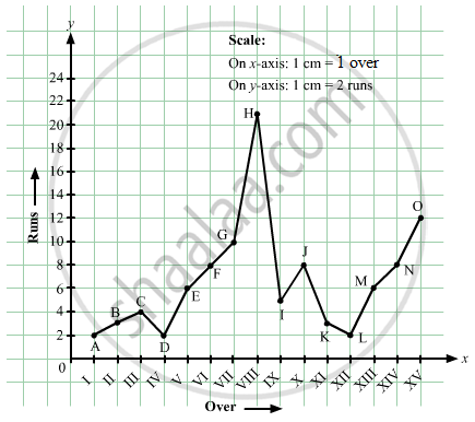
The runs scored by a cricket team in first 15 overs are given below:
| Overs: | I | II | III | IV | V | VI | VII | VIII | IX | X | XI | XII | XIII | XIV | XV |
| Runs: | 2 | 1 | 4 | 2 | 6 | 8 | 10 | 21 | 5 | 8 | 3 | 2 | 6 | 8 | 12 |
Draw the graph representing the above data in two different ways as a graph and as a bar chart.
Advertisements
Solution
Here, over is an independent variable and run is a dependent variable. So, we take overs on the x-axis and runs the on y-axis.
Let us choose the following scale:
On x-axis: 1 cm = 1 over
On y-axis: 1 cm = 2 runs
Now, let us plot (I,2), (II,1), (III,4),...,(XV,12). These points are joined to get the graph representing the given information as shown in the figure below.
RELATED QUESTIONS
The following line graph shows the yearly sales figures for a manufacturing company.

- What were the sales in (i) 2002 (ii) 2006?
- What were the sales in (i) 2003 (ii) 2005?
- Compute the difference between the sales in 2002 and 2006.
- In which year was there the greatest difference between the sales as compared to its previous year?
For an experiment in Botany, two different plants, plant A and plant B were grown under similar laboratory conditions. Their heights were measured at the end of each week for 3 weeks. The results are shown by the following graph.

- How high was Plant A after (i) 2 weeks (ii) 3 weeks?
- How high was Plant B after (i) 2 weeks (ii) 3 weeks?
- How much did Plant A grow during the 3rd week?
- How much did Plant B grow from the end of the 2nd week to the end of the 3rd week?
- During which week did Plant A grow most?
- During which week did Plant B grow least?
- Were the two plants of the same height during any week shown here? Specify.
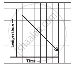
Can there be a time-temperature graph as follows? Justify your answer.
The following table shows the number of patients discharged from a hospital with HIV diagnosis in different years:
| Years: | 2002 | 2003 | 2004 | 2005 | 2006 |
| Number of patients: | 150 | 170 | 195 | 225 | 230 |
Represent this information by a graph.
The following table shows the sales of a commodity during the years 2000 to 2006.
| Years: | 2000 | 2001 | 2002 | 2003 | 2004 | 2005 | 2006 |
| Sales (in lakhs of Rs): | 1.5 | 1.8 | 2.4 | 3.2 | 5.4 | 7.8 | 8.6 |
Draw a graph of this information.
Draw the temperature-time graph in each of the following cases:
| Time (in hours): | 7:00 | 9:00 | 11:00 | 13:00 | 15:00 | 17:00 | 19:00 | 21:00 |
| Temperature (°F) in: | 100 | 101 | 104 | 102 | 100 | 99 | 100 | 98 |
Find out from the growth chart

- What could be the length of this plant on the 14th day? Guess.
Study the given graph and complete the corresponding table below.

Study the graph and answer the questions that follow.
- What information does the graph give?
- On which day was the temperature the least?
- On which day was the temperature 31°C?
- Which was the hottest day?

The following graph shows the number of people present at a certain shop at different times. Observe the graph and answer the following questions.

- What type of a graph is this?
- What information does the graph give?
- What is the busiest time of day at the shop?
- How many people enter the shop when it opens?
- About how many people are there in the shop at 1:30 pm?
