Advertisements
Advertisements
प्रश्न
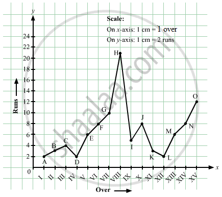
The runs scored by a cricket team in first 15 overs are given below:
| Overs: | I | II | III | IV | V | VI | VII | VIII | IX | X | XI | XII | XIII | XIV | XV |
| Runs: | 2 | 1 | 4 | 2 | 6 | 8 | 10 | 21 | 5 | 8 | 3 | 2 | 6 | 8 | 12 |
Draw the graph representing the above data in two different ways as a graph and as a bar chart.
Advertisements
उत्तर
Here, over is an independent variable and run is a dependent variable. So, we take overs on the x-axis and runs the on y-axis.
Let us choose the following scale:
On x-axis: 1 cm = 1 over
On y-axis: 1 cm = 2 runs
Now, let us plot (I,2), (II,1), (III,4),...,(XV,12). These points are joined to get the graph representing the given information as shown in the figure below.
संबंधित प्रश्न
The following graph shows the temperature of a patient in a hospital, recorded every hour.
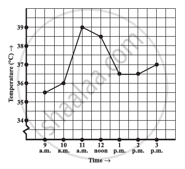
- What was the patient’s temperature at 1 p.m.?
- When was the patient’s temperature 38.5°C?
- The patient’s temperature was the same two times during the period given. What were these two times?
- What was the temperature at 1.30 p.m.? How did you arrive at your answer?
- During which periods did the patients’ temperature showed an upward trend?
The following graph shows the temperature forecast and the actual temperature for each day of a week.

- On which days was the forecast temperature the same as the actual temperature?
- What was the maximum forecast temperature during the week?
- What was the minimum actual temperature during the week?
- On which day did the actual temperature differ the most from the forecast temperature?
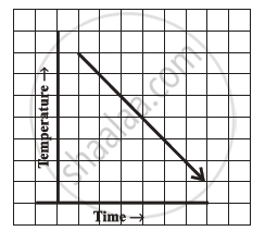
Can there be a time-temperature graph as follows? Justify your answer.
The following table shows the sales of a commodity during the years 2000 to 2006.
| Years: | 2000 | 2001 | 2002 | 2003 | 2004 | 2005 | 2006 |
| Sales (in lakhs of Rs): | 1.5 | 1.8 | 2.4 | 3.2 | 5.4 | 7.8 | 8.6 |
Draw a graph of this information.
Draw the velocity-time graph from the following data:
| Time (in hours): | 7:00 | 8:00 | 9:00 | 10:00 | 11:00 | 12:00 | 13:00 | 14:00 |
| Speed (in km/hr): | 30 | 45 | 60 | 50 | 70 | 50 | 40 | 45 |
The runs scored by two teams A and B in first 10 overs are given below:
| Overs: | I | II | III | IV | V | VI | VII | VIII | IX | X |
| Team A: | 2 | 1 | 8 | 9 | 4 | 5 | 6 | 10 | 6 | 2 |
| Team B: | 5 | 6 | 2 | 10 | 5 | 6 | 3 | 4 | 8 | 10 |
Draw a graph depicting the data, making the graphs on the same axes in each case in two different ways as a graph and as a bar chart.
Which graphs of the following represent the table below?
| Length of Side of a Square | 1 | 2 | 3 | 4 | 5 |
| Perimeter | 4 | 8 | 12 | 16 | 20 |
Plot a line graph for the variables p and q where p is two times q i.e, the equation is p = 2q. Then find the value of q when p = 8
Study the graph and answer the questions that follow.
- What information does the graph give?
- On which day was the temperature the least?
- On which day was the temperature 31°C?
- Which was the hottest day?

The following graph shows the number of people present at a certain shop at different times. Observe the graph and answer the following questions.

- What type of a graph is this?
- What information does the graph give?
- What is the busiest time of day at the shop?
- How many people enter the shop when it opens?
- About how many people are there in the shop at 1:30 pm?
