Advertisements
Advertisements
प्रश्न
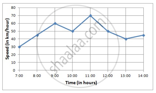
Draw the velocity-time graph from the following data:
| Time (in hours): | 7:00 | 8:00 | 9:00 | 10:00 | 11:00 | 12:00 | 13:00 | 14:00 |
| Speed (in km/hr): | 30 | 45 | 60 | 50 | 70 | 50 | 40 | 45 |
Advertisements
उत्तर
Here, time is an independent variable and speed is a dependent variable. So, we take time on the x-axis and speed on the y-axis.
Let us choose the following scale:
On x-axis: 2 big division = 1 hour
On y-axis: 1 big division = 10 km/hr
Let us assume that on the x-axis, the coordinate of origin (O) is 7:00.
So, the coordinates of O are (7:00,0).
Now, let us plot (7:00,30), (8:00,45), (9:00,60), (10:00,50), (11:00,70), (12:00,50), (13:00,40), (14:00,45). These points are joined to get the graph representing the given information as shown in the figure below.
संबंधित प्रश्न
The following graph shows the temperature of a patient in a hospital, recorded every hour.
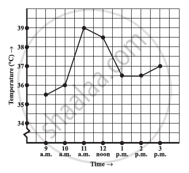
- What was the patient’s temperature at 1 p.m.?
- When was the patient’s temperature 38.5°C?
- The patient’s temperature was the same two times during the period given. What were these two times?
- What was the temperature at 1.30 p.m.? How did you arrive at your answer?
- During which periods did the patients’ temperature showed an upward trend?
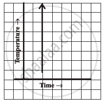
Can there be a time-temperature graph as follows? Justify your answer.
The following table shows the number of patients discharged from a hospital with HIV diagnosis in different years:
| Years: | 2002 | 2003 | 2004 | 2005 | 2006 |
| Number of patients: | 150 | 170 | 195 | 225 | 230 |
Represent this information by a graph.
The runs scored by two teams A and B in first 10 overs are given below:
| Overs: | I | II | III | IV | V | VI | VII | VIII | IX | X |
| Team A: | 2 | 1 | 8 | 9 | 4 | 5 | 6 | 10 | 6 | 2 |
| Team B: | 5 | 6 | 2 | 10 | 5 | 6 | 3 | 4 | 8 | 10 |
Draw a graph depicting the data, making the graphs on the same axes in each case in two different ways as a graph and as a bar chart.
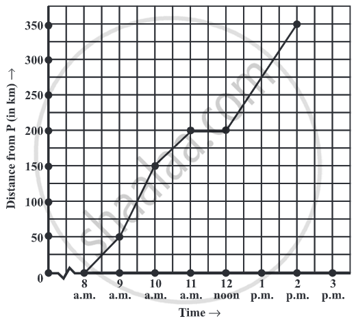
Which graphs of the following represent the table below?
| Length of Side of a Square | 1 | 2 | 3 | 4 | 5 |
| Perimeter | 4 | 8 | 12 | 16 | 20 |
A line graph can also be a whole unbroken line.
Study the given graph and complete the corresponding table below.

Plot a line graph for the variables p and q where p is two times q i.e, the equation is p = 2q. Then find.
- the value of p when q = 3
- the value of q when p = 8
As part of his science project, Prithvi was supposed to record the temperature every hour one Saturday from 6 am to midnight. At noon, he was taking lunch and forgot to record the temperature. At 8:00 pm, his favourite show came on and so forgot again. He recorded the data so collected on a graph sheet as shown below.
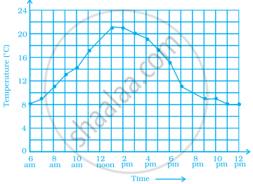
- Why does it make sense to connect the points in this situation?
- Describe the overall trend, or pattern, in the way the temperature changes over the time period shown on the graph.
- Estimate the temperature at noon and 8 pm.
