Advertisements
Advertisements
Question
Study the graph and answer the questions that follow.
- What information does the graph give?
- On which day was the temperature the least?
- On which day was the temperature 31°C?
- Which was the hottest day?

Advertisements
Solution
- The information obtained from the given graph is that the maximum temperature is 34°C and minimum temperature is 25°C in a week.
- On Sunday, the temperature was 25°C. So, it is least temperature in the week.
- On Saturday, the temperature was 31°C.
- On Friday, the temperature was maximum i.e. 34°C. Hence, it is the hottest day of the week.
APPEARS IN
RELATED QUESTIONS
The following graph shows the temperature of a patient in a hospital, recorded every hour.
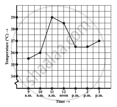
- What was the patient’s temperature at 1 p.m.?
- When was the patient’s temperature 38.5°C?
- The patient’s temperature was the same two times during the period given. What were these two times?
- What was the temperature at 1.30 p.m.? How did you arrive at your answer?
- During which periods did the patients’ temperature showed an upward trend?
The following graph shows the temperature forecast and the actual temperature for each day of a week.

- On which days was the forecast temperature the same as the actual temperature?
- What was the maximum forecast temperature during the week?
- What was the minimum actual temperature during the week?
- On which day did the actual temperature differ the most from the forecast temperature?
A courier-person cycles from a town to a neighboring suburban area to deliver a parcel to a merchant. His distance from the town at different times is shown by the following graph.
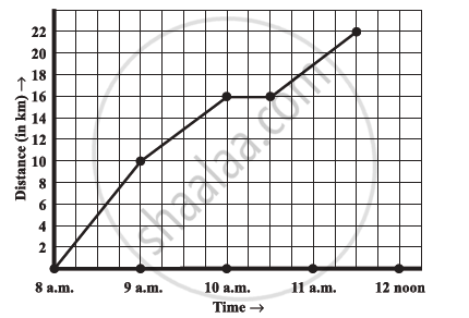
- What is the scale taken for the time axis?
- How much time did the person take for the travel?
- How far is the place of the merchant from the town?
- Did the person stop on his way? Explain.
- During which period did he ride fastest?
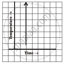
Can there be a time-temperature graph as follows? Justify your answer.
The following table shows the number of patients discharged from a hospital with HIV diagnosis in different years:
| Years: | 2002 | 2003 | 2004 | 2005 | 2006 |
| Number of patients: | 150 | 170 | 195 | 225 | 230 |
Represent this information by a graph.
The runs scored by a cricket team in first 15 overs are given below:
| Overs: | I | II | III | IV | V | VI | VII | VIII | IX | X | XI | XII | XIII | XIV | XV |
| Runs: | 2 | 1 | 4 | 2 | 6 | 8 | 10 | 21 | 5 | 8 | 3 | 2 | 6 | 8 | 12 |
Draw the graph representing the above data in two different ways as a graph and as a bar chart.
The runs scored by two teams A and B in first 10 overs are given below:
| Overs: | I | II | III | IV | V | VI | VII | VIII | IX | X |
| Team A: | 2 | 1 | 8 | 9 | 4 | 5 | 6 | 10 | 6 | 2 |
| Team B: | 5 | 6 | 2 | 10 | 5 | 6 | 3 | 4 | 8 | 10 |
Draw a graph depicting the data, making the graphs on the same axes in each case in two different ways as a graph and as a bar chart.
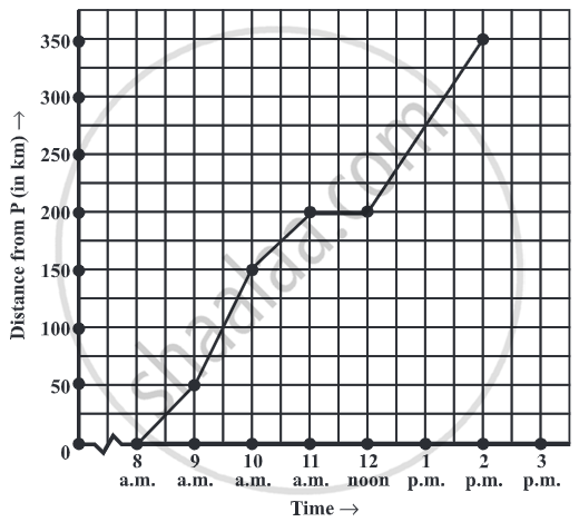
A graph that displays data that changes continuously over periods of time is ______.
Plot a line graph for the variables p and q where p is two times q i.e, the equation is p = 2q. Then find.
- the value of p when q = 3
- the value of q when p = 8
