Advertisements
Advertisements
Question
The following graph shows the temperature forecast and the actual temperature for each day of a week.

- On which days was the forecast temperature the same as the actual temperature?
- What was the maximum forecast temperature during the week?
- What was the minimum actual temperature during the week?
- On which day did the actual temperature differ the most from the forecast temperature?
Advertisements
Solution
- The forecast temperature was the same as the actual temperature on Tuesday, Friday, and Sunday.
- The maximum forecast temperature during the week was 35°C.
- The minimum actual temperature during the week was 15°C.
- On Thursday, the actual temperature differed the most from the forecast temperature.
APPEARS IN
RELATED QUESTIONS
The following line graph shows the yearly sales figures for a manufacturing company.

- What were the sales in (i) 2002 (ii) 2006?
- What were the sales in (i) 2003 (ii) 2005?
- Compute the difference between the sales in 2002 and 2006.
- In which year was there the greatest difference between the sales as compared to its previous year?
Use the tables below to draw linear graphs.
The number of days a hill side city received snow in different years.
| Year | 2003 | 2004 | 2005 | 2006 |
| Days | 8 | 10 | 5 | 12 |
A courier-person cycles from a town to a neighboring suburban area to deliver a parcel to a merchant. His distance from the town at different times is shown by the following graph.
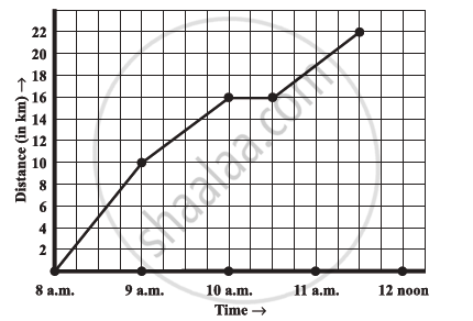
- What is the scale taken for the time axis?
- How much time did the person take for the travel?
- How far is the place of the merchant from the town?
- Did the person stop on his way? Explain.
- During which period did he ride fastest?
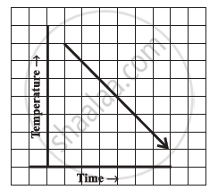
Can there be a time-temperature graph as follows? Justify your answer.
The following table shows the number of patients discharged from a hospital with HIV diagnosis in different years:
| Years: | 2002 | 2003 | 2004 | 2005 | 2006 |
| Number of patients: | 150 | 170 | 195 | 225 | 230 |
Represent this information by a graph.
Draw the temperature-time graph in each of the following cases:
| Time (in hours): | 8:00 | 10:00 | 12:00 | 14:00 | 16:00 | 18:00 | 20:00 |
| Temperature (°F) in: | 100 | 101 | 104 | 103 | 99 | 98 | 100 |
Find out from the growth chart

- Between which days did the length of the plant change the most?
Find out from the growth chart
- Will the plant keep growing all the time? What will be its length on the 100th day? Make a guess!
A graph that displays data that changes continuously over periods of time is ______.
Plot a line graph for the variables p and q where p is two times q i.e, the equation is p = 2q. Then find the value of q when p = 8
