Advertisements
Advertisements
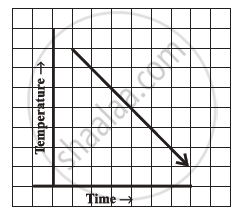
Question
Can there be a time-temperature graph as follows? Justify your answer.
Advertisements
Solution
This can be a time-temperature graph, as the temperature can decrease with the decrease in time.
APPEARS IN
RELATED QUESTIONS
Use the tables below to draw linear graphs.
The number of days a hill side city received snow in different years.
| Year | 2003 | 2004 | 2005 | 2006 |
| Days | 8 | 10 | 5 | 12 |
Use the tables below to draw linear graphs.
Population (in thousands) of men and women in a village in different years.
| Year | 2003 | 2004 | 2005 | 2006 | 2007 |
| Number of men | 12 | 12.5 | 13 | 13.2 | 13.5 |
| Number of women | 11.3 | 11.9 | 13 | 13.6 | 12.8 |
The following table shows the number of patients discharged from a hospital with HIV diagnosis in different years:
| Years: | 2002 | 2003 | 2004 | 2005 | 2006 |
| Number of patients: | 150 | 170 | 195 | 225 | 230 |
Represent this information by a graph.
Find out from the growth chart

- What could be the length of this plant on the 14th day? Guess.
A graph that displays data that changes continuously over periods of time is ______.
Which graphs of the following represent the table below?
| Length of Side of a Square | 1 | 2 | 3 | 4 | 5 |
| Perimeter | 4 | 8 | 12 | 16 | 20 |
Study the given graph and complete the corresponding table below.

Study the given graph and complete the corresponding table below.

The following graph shows the change in temperature of a block of ice when heated. Use the graph to answer the following questions:
- For how many seconds did the ice block have no change in temperature?
- For how long was there a change in temperature?
- After how many seconds of heating did the temperature become constant at 0°C?
- What was the temperature after 25 seconds?
- What will be the temperature after 1.5 minutes? Justify your answer.

As part of his science project, Prithvi was supposed to record the temperature every hour one Saturday from 6 am to midnight. At noon, he was taking lunch and forgot to record the temperature. At 8:00 pm, his favourite show came on and so forgot again. He recorded the data so collected on a graph sheet as shown below.
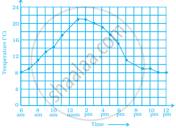
- Why does it make sense to connect the points in this situation?
- Describe the overall trend, or pattern, in the way the temperature changes over the time period shown on the graph.
- Estimate the temperature at noon and 8 pm.
