Advertisements
Advertisements
Question
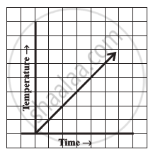
Can there be a time-temperature graph as follows? Justify your answer.
Advertisements
Solution
This can be a time-temperature graph, as the temperature can increase with the increase in time.
RELATED QUESTIONS
The following line graph shows the yearly sales figures for a manufacturing company.

- What were the sales in (i) 2002 (ii) 2006?
- What were the sales in (i) 2003 (ii) 2005?
- Compute the difference between the sales in 2002 and 2006.
- In which year was there the greatest difference between the sales as compared to its previous year?
Use the tables below to draw linear graphs.
The number of days a hill side city received snow in different years.
| Year | 2003 | 2004 | 2005 | 2006 |
| Days | 8 | 10 | 5 | 12 |
Use the tables below to draw linear graphs.
Population (in thousands) of men and women in a village in different years.
| Year | 2003 | 2004 | 2005 | 2006 | 2007 |
| Number of men | 12 | 12.5 | 13 | 13.2 | 13.5 |
| Number of women | 11.3 | 11.9 | 13 | 13.6 | 12.8 |
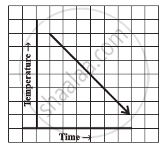
Can there be a time-temperature graph as follows? Justify your answer.
Draw the temperature-time graph in each of the following cases:
| Time (in hours): | 8:00 | 10:00 | 12:00 | 14:00 | 16:00 | 18:00 | 20:00 |
| Temperature (°F) in: | 100 | 101 | 104 | 103 | 99 | 98 | 100 |
The runs scored by two teams A and B in first 10 overs are given below:
| Overs: | I | II | III | IV | V | VI | VII | VIII | IX | X |
| Team A: | 2 | 1 | 8 | 9 | 4 | 5 | 6 | 10 | 6 | 2 |
| Team B: | 5 | 6 | 2 | 10 | 5 | 6 | 3 | 4 | 8 | 10 |
Draw a graph depicting the data, making the graphs on the same axes in each case in two different ways as a graph and as a bar chart.
Find out from the growth chart
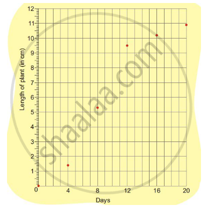
- Between which days did the length of the plant change the most?
Find out from the growth chart
- What could be the length of this plant on the 14th day? Guess.
The following graph shows the change in temperature of a block of ice when heated. Use the graph to answer the following questions:
- For how many seconds did the ice block have no change in temperature?
- For how long was there a change in temperature?
- After how many seconds of heating did the temperature become constant at 0°C?
- What was the temperature after 25 seconds?
- What will be the temperature after 1.5 minutes? Justify your answer.

The following graph shows the number of people present at a certain shop at different times. Observe the graph and answer the following questions.

- What type of a graph is this?
- What information does the graph give?
- What is the busiest time of day at the shop?
- How many people enter the shop when it opens?
- About how many people are there in the shop at 1:30 pm?
