Advertisements
Advertisements
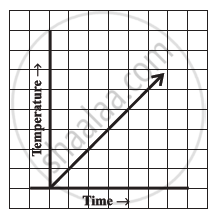
प्रश्न
Can there be a time-temperature graph as follows? Justify your answer.
Advertisements
उत्तर
This can be a time-temperature graph, as the temperature can increase with the increase in time.
APPEARS IN
संबंधित प्रश्न
The following graph shows the temperature of a patient in a hospital, recorded every hour.
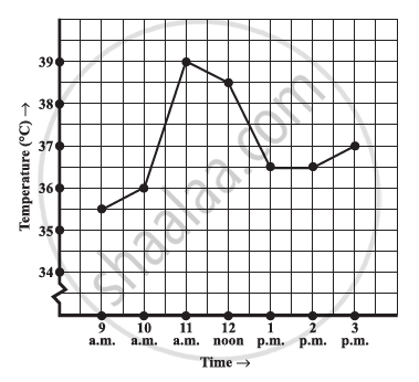
- What was the patient’s temperature at 1 p.m.?
- When was the patient’s temperature 38.5°C?
- The patient’s temperature was the same two times during the period given. What were these two times?
- What was the temperature at 1.30 p.m.? How did you arrive at your answer?
- During which periods did the patients’ temperature showed an upward trend?
For an experiment in Botany, two different plants, plant A and plant B were grown under similar laboratory conditions. Their heights were measured at the end of each week for 3 weeks. The results are shown by the following graph.

- How high was Plant A after (i) 2 weeks (ii) 3 weeks?
- How high was Plant B after (i) 2 weeks (ii) 3 weeks?
- How much did Plant A grow during the 3rd week?
- How much did Plant B grow from the end of the 2nd week to the end of the 3rd week?
- During which week did Plant A grow most?
- During which week did Plant B grow least?
- Were the two plants of the same height during any week shown here? Specify.
Use the tables below to draw linear graphs.
The number of days a hill side city received snow in different years.
| Year | 2003 | 2004 | 2005 | 2006 |
| Days | 8 | 10 | 5 | 12 |
Use the tables below to draw linear graphs.
Population (in thousands) of men and women in a village in different years.
| Year | 2003 | 2004 | 2005 | 2006 | 2007 |
| Number of men | 12 | 12.5 | 13 | 13.2 | 13.5 |
| Number of women | 11.3 | 11.9 | 13 | 13.6 | 12.8 |
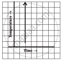
Can there be a time-temperature graph as follows? Justify your answer.
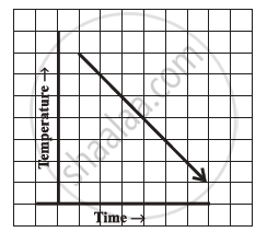
Can there be a time-temperature graph as follows? Justify your answer.
Find out from the growth chart

- Between which days did the length of the plant change the most?
A graph that displays data that changes continuously over periods of time is ______.
Study the given graph and complete the corresponding table below.

Study the given graph and complete the corresponding table below.

