Advertisements
Advertisements
प्रश्न
A graph that displays data that changes continuously over periods of time is ______.
विकल्प
bar graph
pie chart
histogram
line graph
Advertisements
उत्तर
A graph that displays data that changes continuously over periods of time is line graph.
Explanation:
Line graph is an important way to represent and compare the data which varies continuously.
A line graph displays the relation between two varying quantities.
In a line graph, we connect all the points by a line segment while in bar graph and histogram, we use rectangles of uniform width.
APPEARS IN
संबंधित प्रश्न
Use the tables below to draw linear graphs.
Population (in thousands) of men and women in a village in different years.
| Year | 2003 | 2004 | 2005 | 2006 | 2007 |
| Number of men | 12 | 12.5 | 13 | 13.2 | 13.5 |
| Number of women | 11.3 | 11.9 | 13 | 13.6 | 12.8 |
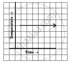
Can there be a time-temperature graph as follows? Justify your answer.
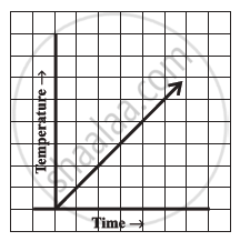
Can there be a time-temperature graph as follows? Justify your answer.
The runs scored by two teams A and B in first 10 overs are given below:
| Overs: | I | II | III | IV | V | VI | VII | VIII | IX | X |
| Team A: | 2 | 1 | 8 | 9 | 4 | 5 | 6 | 10 | 6 | 2 |
| Team B: | 5 | 6 | 2 | 10 | 5 | 6 | 3 | 4 | 8 | 10 |
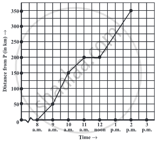
Draw a graph depicting the data, making the graphs on the same axes in each case in two different ways as a graph and as a bar chart.
Find out from the growth chart

- What could be the length of this plant on the 14th day? Guess.
Find out from the growth chart
- Will the plant keep growing all the time? What will be its length on the 100th day? Make a guess!
A line graph can also be a whole unbroken line.
Plot a line graph for the variables p and q where p is two times q i.e, the equation is p = 2q. Then find.
- the value of p when q = 3
- the value of q when p = 8
Plot a line graph for the variables p and q where p is two times q i.e, the equation is p = 2q. Then find the value of q when p = 8
