Advertisements
Advertisements
प्रश्न
Use the tables below to draw linear graphs.
The number of days a hill side city received snow in different years.
| Year | 2003 | 2004 | 2005 | 2006 |
| Days | 8 | 10 | 5 | 12 |
Advertisements
उत्तर
By taking the years on the x-axis and the number of days on y-axis and taking scale as 1 unit = 2 days on y-axis and 2 unit = 1 year on x-axis, the linear graph of the given information can be drawn as follows:

APPEARS IN
संबंधित प्रश्न
The following line graph shows the yearly sales figures for a manufacturing company.

- What were the sales in (i) 2002 (ii) 2006?
- What were the sales in (i) 2003 (ii) 2005?
- Compute the difference between the sales in 2002 and 2006.
- In which year was there the greatest difference between the sales as compared to its previous year?
The following graph shows the temperature forecast and the actual temperature for each day of a week.

- On which days was the forecast temperature the same as the actual temperature?
- What was the maximum forecast temperature during the week?
- What was the minimum actual temperature during the week?
- On which day did the actual temperature differ the most from the forecast temperature?
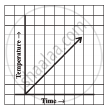
Can there be a time-temperature graph as follows? Justify your answer.
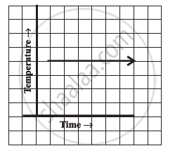
Can there be a time-temperature graph as follows? Justify your answer.
The following table shows the number of patients discharged from a hospital with HIV diagnosis in different years:
| Years: | 2002 | 2003 | 2004 | 2005 | 2006 |
| Number of patients: | 150 | 170 | 195 | 225 | 230 |
Represent this information by a graph.
The following table shows the sales of a commodity during the years 2000 to 2006.
| Years: | 2000 | 2001 | 2002 | 2003 | 2004 | 2005 | 2006 |
| Sales (in lakhs of Rs): | 1.5 | 1.8 | 2.4 | 3.2 | 5.4 | 7.8 | 8.6 |
Draw a graph of this information.
Draw the velocity-time graph from the following data:
| Time (in hours): | 7:00 | 8:00 | 9:00 | 10:00 | 11:00 | 12:00 | 13:00 | 14:00 |
| Speed (in km/hr): | 30 | 45 | 60 | 50 | 70 | 50 | 40 | 45 |
Find out from the growth chart

- Between which days did the length of the plant change the most?
Which graphs of the following represent the table below?
| Length of Side of a Square | 1 | 2 | 3 | 4 | 5 |
| Perimeter | 4 | 8 | 12 | 16 | 20 |
Plot a line graph for the variables p and q where p is two times q i.e, the equation is p = 2q. Then find the value of q when p = 8
