Advertisements
Advertisements
प्रश्न
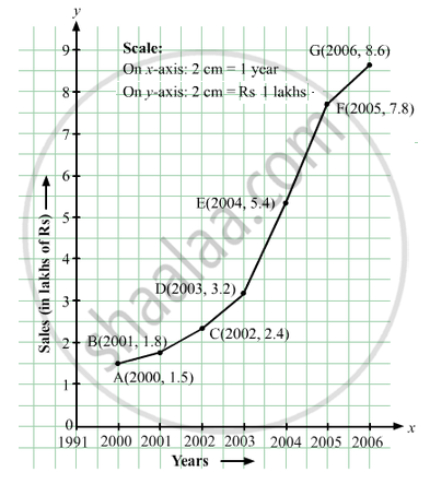
The following table shows the sales of a commodity during the years 2000 to 2006.
| Years: | 2000 | 2001 | 2002 | 2003 | 2004 | 2005 | 2006 |
| Sales (in lakhs of Rs): | 1.5 | 1.8 | 2.4 | 3.2 | 5.4 | 7.8 | 8.6 |
Draw a graph of this information.
Advertisements
उत्तर
Here, year is an independent variable and sales is a dependent variable. So, we take year on the x-axis and sales on the y-axis.
Let us choose the following scale:
On x-axis: 2 cm = 1 year
On y-axis: 2 cm = 1 lakh rupees
Assume that on x-axis, origin (O) represents 1991.
So, the coordinates of O are (1991,0).
Now, let us plot (2000, 1.5), (2001, 1.8), (2002, 2.4), (2003, 3.2), (2004, 5.4), (2005, 7.8) and (2006, 8.6). These points are joined to get the graph representing the given information as shown in the figure below.
संबंधित प्रश्न
A courier-person cycles from a town to a neighboring suburban area to deliver a parcel to a merchant. His distance from the town at different times is shown by the following graph.
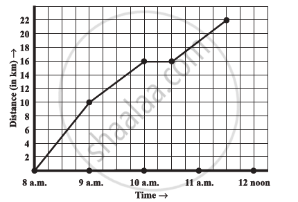
- What is the scale taken for the time axis?
- How much time did the person take for the travel?
- How far is the place of the merchant from the town?
- Did the person stop on his way? Explain.
- During which period did he ride fastest?
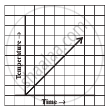
Can there be a time-temperature graph as follows? Justify your answer.
The following table shows the number of patients discharged from a hospital with HIV diagnosis in different years:
| Years: | 2002 | 2003 | 2004 | 2005 | 2006 |
| Number of patients: | 150 | 170 | 195 | 225 | 230 |
Represent this information by a graph.
Draw the temperature-time graph in each of the following cases:
| Time (in hours): | 7:00 | 9:00 | 11:00 | 13:00 | 15:00 | 17:00 | 19:00 | 21:00 |
| Temperature (°F) in: | 100 | 101 | 104 | 102 | 100 | 99 | 100 | 98 |
Draw the velocity-time graph from the following data:
| Time (in hours): | 7:00 | 8:00 | 9:00 | 10:00 | 11:00 | 12:00 | 13:00 | 14:00 |
| Speed (in km/hr): | 30 | 45 | 60 | 50 | 70 | 50 | 40 | 45 |
Find out from the growth chart

- Between which days did the length of the plant change the most?
A graph that displays data that changes continuously over periods of time is ______.
Study the given graph and complete the corresponding table below.

Study the graph and answer the questions that follow.
- What information does the graph give?
- On which day was the temperature the least?
- On which day was the temperature 31°C?
- Which was the hottest day?

As part of his science project, Prithvi was supposed to record the temperature every hour one Saturday from 6 am to midnight. At noon, he was taking lunch and forgot to record the temperature. At 8:00 pm, his favourite show came on and so forgot again. He recorded the data so collected on a graph sheet as shown below.
- Why does it make sense to connect the points in this situation?
- Describe the overall trend, or pattern, in the way the temperature changes over the time period shown on the graph.
- Estimate the temperature at noon and 8 pm.
