Advertisements
Advertisements
प्रश्न
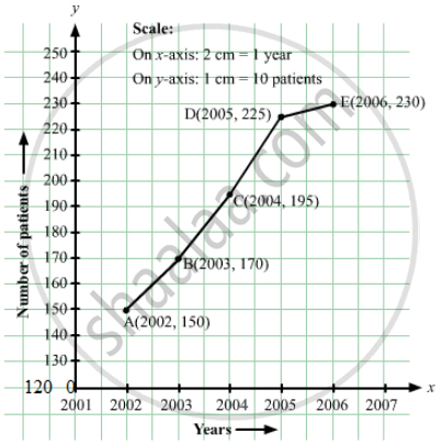
The following table shows the number of patients discharged from a hospital with HIV diagnosis in different years:
| Years: | 2002 | 2003 | 2004 | 2005 | 2006 |
| Number of patients: | 150 | 170 | 195 | 225 | 230 |
Represent this information by a graph.
Advertisements
उत्तर
Here, years is an independent variable and the number of patients is a dependent variable. So, we take years on the x-axis and the number of patients on the y-axis.
Let us choose the following scale:
On x-axis: 2 cm = 1 year
On y-axis: 1 cm = 10 patients
Also, let us assume that on the x-axis, origin (O) represents 2001 and on the y-axis, origin (O) represents 120, i.e. O (2001, 120).
Now, let us plot (2002, 150), (2003, 170), (2004, 195), (2005, 225), (2006, 230). These points are joined to get the graph representing the given information as shown in the figure below.
संबंधित प्रश्न
The following line graph shows the yearly sales figures for a manufacturing company.

- What were the sales in (i) 2002 (ii) 2006?
- What were the sales in (i) 2003 (ii) 2005?
- Compute the difference between the sales in 2002 and 2006.
- In which year was there the greatest difference between the sales as compared to its previous year?
For an experiment in Botany, two different plants, plant A and plant B were grown under similar laboratory conditions. Their heights were measured at the end of each week for 3 weeks. The results are shown by the following graph.

- How high was Plant A after (i) 2 weeks (ii) 3 weeks?
- How high was Plant B after (i) 2 weeks (ii) 3 weeks?
- How much did Plant A grow during the 3rd week?
- How much did Plant B grow from the end of the 2nd week to the end of the 3rd week?
- During which week did Plant A grow most?
- During which week did Plant B grow least?
- Were the two plants of the same height during any week shown here? Specify.
Use the tables below to draw linear graphs.
Population (in thousands) of men and women in a village in different years.
| Year | 2003 | 2004 | 2005 | 2006 | 2007 |
| Number of men | 12 | 12.5 | 13 | 13.2 | 13.5 |
| Number of women | 11.3 | 11.9 | 13 | 13.6 | 12.8 |
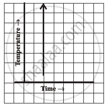
Can there be a time-temperature graph as follows? Justify your answer.
The following table shows the sales of a commodity during the years 2000 to 2006.
| Years: | 2000 | 2001 | 2002 | 2003 | 2004 | 2005 | 2006 |
| Sales (in lakhs of Rs): | 1.5 | 1.8 | 2.4 | 3.2 | 5.4 | 7.8 | 8.6 |
Draw a graph of this information.
Find out from the growth chart

- Will the plant keep growing all the time? What will be its length on the 100th day? Make a guess!
Which graphs of the following represent the table below?
| Length of Side of a Square | 1 | 2 | 3 | 4 | 5 |
| Perimeter | 4 | 8 | 12 | 16 | 20 |
Study the given graph and complete the corresponding table below.

Study the given graph and complete the corresponding table below.

Study the graph and answer the questions that follow.
- What information does the graph give?
- On which day was the temperature the least?
- On which day was the temperature 31°C?
- Which was the hottest day?

