Advertisements
Advertisements
प्रश्न
The following line graph shows the yearly sales figures for a manufacturing company.

- What were the sales in (i) 2002 (ii) 2006?
- What were the sales in (i) 2003 (ii) 2005?
- Compute the difference between the sales in 2002 and 2006.
- In which year was there the greatest difference between the sales as compared to its previous year?
Advertisements
उत्तर
- In 2002, the sales were Rs 4 crore.
- In 2006, the sales were Rs 8 crore.
- In 2003, the sales were Rs 7 crore.
- In 2005, the sales were Rs 10 crore
- sales in year 2002 = 8 crores
- Sales in year, 2006 = 4 crores
- Difference between the two = 8 − 4 = Rs 4 crore
-
- Difference between the sales of the year 2006 and 2005
= Rs (10 − 8) crores = Rs 2 crores - Difference between the sales of the year 2005 and 2004
= Rs (10 − 6) crores = Rs 4 crores - Difference between the sales of the year 2004 and 2003
= Rs (7 − 6) crore = Rs 1 crore - Difference between the sales of the year 2003 and 2002
= Rs (7 − 4) crores = Rs 3 crores
Hence, the difference was the highest in 2005 as compared to the previous year, 2004.
- Difference between the sales of the year 2006 and 2005
APPEARS IN
संबंधित प्रश्न
Use the tables below to draw linear graphs.
Population (in thousands) of men and women in a village in different years.
| Year | 2003 | 2004 | 2005 | 2006 | 2007 |
| Number of men | 12 | 12.5 | 13 | 13.2 | 13.5 |
| Number of women | 11.3 | 11.9 | 13 | 13.6 | 12.8 |
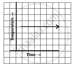
Can there be a time-temperature graph as follows? Justify your answer.
The following table shows the number of patients discharged from a hospital with HIV diagnosis in different years:
| Years: | 2002 | 2003 | 2004 | 2005 | 2006 |
| Number of patients: | 150 | 170 | 195 | 225 | 230 |
Represent this information by a graph.
Draw the temperature-time graph in each of the following cases:
| Time (in hours): | 7:00 | 9:00 | 11:00 | 13:00 | 15:00 | 17:00 | 19:00 | 21:00 |
| Temperature (°F) in: | 100 | 101 | 104 | 102 | 100 | 99 | 100 | 98 |
Find out from the growth chart

- What could be the length of this plant on the 14th day? Guess.
Find out from the growth chart
- Will the plant keep growing all the time? What will be its length on the 100th day? Make a guess!
A graph that displays data that changes continuously over periods of time is ______.
Plot a line graph for the variables p and q where p is two times q i.e, the equation is p = 2q. Then find.
- the value of p when q = 3
- the value of q when p = 8
Plot a line graph for the variables p and q where p is two times q i.e, the equation is p = 2q. Then find the value of q when p = 8
The following graph shows the change in temperature of a block of ice when heated. Use the graph to answer the following questions:
- For how many seconds did the ice block have no change in temperature?
- For how long was there a change in temperature?
- After how many seconds of heating did the temperature become constant at 0°C?
- What was the temperature after 25 seconds?
- What will be the temperature after 1.5 minutes? Justify your answer.

