Advertisements
Advertisements
प्रश्न
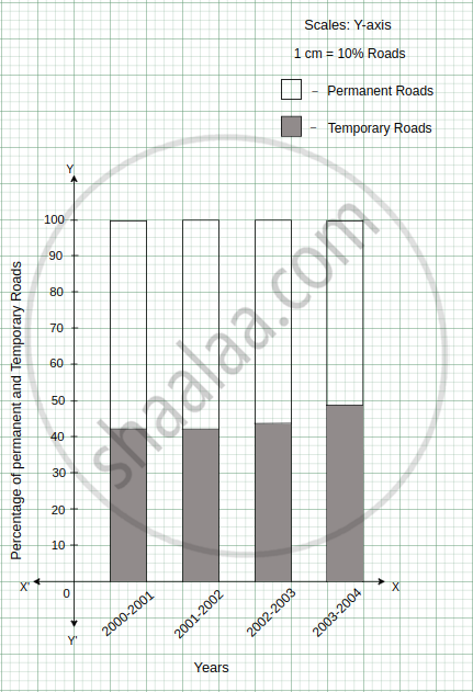
In the table given below, the information is given about roads. Using this draw a sub-divided and percentage bar diagram (Approximate the percentages to the nearest integer).
| Year | Permanent Roads ( Lakh km.) |
Temporary Roads ( Lakh km.) |
| 2000-2001 | 14 | 10 |
| 2001-2002 | 15 | 11 |
| 2002-2003 | 17 | 13 |
| 2003-2004 | 20 | 19 |
Advertisements
उत्तर
1. Sub-divided Bar Diagram:
| Year | Permanent Roads (Lakh km.) |
Temporary Roads (Lakh km.) |
Total |
| 2000-2001 | 14 | 10 | 24 |
| 2001-2002 | 15 | 11 | 26 |
| 2002-2003 | 17 | 13 | 30 |
| 2003-2004 | 20 | 19 | 39 |

2. Percentage Bar Diagram:
| Year | Permanent Roads (Lakh km.) |
Percentage of permanent roads | Temporary Roads (Lakh km.) |
Percentage of temporary roads |
| 2000-2001 | 14 | = `14 / (14 + 10)` × 100 = `1400 / 24` = 58.33 ≈ 58 | 10 | = `10/ (14 + 10)` × 100 = `1000 / 24` = 41.66 ≈ 42 |
| 2001-2002 | 15 | = `15 / (15 + 11)` × 100 = `1500 / 26 ` = 57.69 ≈ 58 | 11 | = `11/ (15 + 11)` × 100 = `1100 / 26` = 42.30 ≈ 42 |
| 2002-2003 | 17 | = `17 / (17+13)` × 100 = `1700 / 30` = 56.66 ≈ 57 | 13 | = `13 / (17 + 13)` × 100 = `1300/30` = 43.33 ≈ 43 |
| 2003-2004 | 20 | = `20 / ( 20 + 19)` × 100 = `2000 / 39` = 51.28 ≈ 51 | 19 | = `19/( 20 + 19)` × 100 = `1900/39` = 48.71 ≈ 49 |
APPEARS IN
संबंधित प्रश्न
Number of children in six different classes are given below. Represent the data on a bar graph.
| Class | Fifth | Sixth | Seventh | Eighth | Ninth | Tenth |
| Number of children | 135 | 120 | 95 | 100 | 90 | 80 |
- How would you choose a scale?
- Answer the following questions:
- Which class has the maximum number of children? And the minimum?
- Find the ratio of students of class sixth to the students of class eight.
Plot the points (2, 8), (7, 8) and (12, 8). Join these points in pairs. Do they lie on a line? What do you observe?
The following table shows the number of Buses and Trucks in nearest lakh units. Draw percentage bar-diagram. (Approximate the percentages to the nearest integer)
| Year | No. of Trucks | No. of Buses |
| 2005-2006 | 47 | 9 |
| 2007-2008 | 56 | 13 |
| 2008-2009 | 60 | 16 |
| 2009-2010 | 63 | 18 |
The graph shows the maximum temperatures recorded for two consecutive weeks of a town. Study the graph and answer the questions that follow.

- What information is given by the two axes?
- In which week was the temperature higher on most of the days?
- On which day was the temperature same in both the weeks?
- On which day was the difference in temperatures the maximum for both the weeks?
- What were the temperatures for both the weeks on Thursday?
- On which day was the temperature 35°C for the first week?
- On which day was the temperature highest for the second week?
In a bar graph, the gap between two consecutive bars may not be the same.
In a bar graph, each bar (rectangle) represents only one value of the numerical data.
The bar graph given below represents the circulation of newspapers in different languages in a town.
Study the bar graph and answer the following questions:
Scale: 1 unit length = 200 Newspapers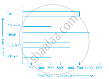
- What is the circulation of English newspaper?
- Name the two languages in which circulation of newspaper is the same.
- By how much is the circulation of newspaper in Hindi more than the newspaper in Bengali?
Read the bar graph given below and answer the following questions:
Scale: 1 unit = 50 students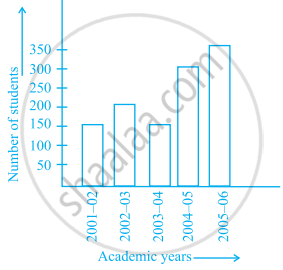
- What information is given by the bar graph?
- In which year is the number of students maximum?
- In which year is the number of students twice as that of 2001 – 02?
- In which year did the number of students decrease as compared to previous year?
- In which year is the increase in number of students maximum as compared to the previous year?
The lengths in km (rounded to nearest hundred) of some major rivers of India is given below:
| River | Length (in km) |
| Narmada | 1300 |
| Mahanadi | 900 |
| Brahmputra | 2900 |
| Ganga | 2500 |
| Kaveri | 800 |
| Krishna | 1300 |
Draw a bar graph to represent the above information.
The following table gives the number of vehicles passing through a toll gate, every hour from 8.00 am. to 1.00 pm:
| Time Interval |
8.00 to 9.00 |
9.00 to 10.00 |
10.00 to 11.00 |
11.00 to 12.00 |
12.00 to 1.00 |
| Number of vehicles |
250 | 450 | 300 | 250 | 150 |
Draw a bar graph representing the above data.
Prepare a bar graph of the data given in the question.
| Surname | Number of people |
| Khan |  |
| Patel |  |
| Rao |  |
| Roy |  |
| Saikia |  |
| Singh |  |
______ can be used to compare two collections of data.
The bar graph given below shows the marks of students of a class in a particular subject:

Study the bar graph and answer the following questions:
- If 40 is the pass mark, then how many students have failed?
- How many students got marks from 50 to 69?
- How many students scored 90 marks and above?
- If students who scored marks above 80 are given merits then how many merit holders are there?
- What is the strength of the class?
Study the double bar graph shown below and answer the questions that follow:

- What information is represented by the above double bar graph?
- In which month sales of Brand A decreased as compared to the previous month?
- What is the difference in sales of both the Brands for the month of June?
- Find the average sales of Brand B for the six months.
- List all months for which the sales of Brand B was less than that of Brand A.
- Find the ratio of sales of Brand A as compared to Brand B for the month of January.
Study the double bar graph and answer the questions that follow:

- What information does the double bar graph represent?
- Find the total number of boys in all sections of Class VII.
- In which sections, the number of girls is greater than the number of boys?
- In which section, the number of boys is the maximum?
- In which section, the number of girls is the least?
The marks out of 100 obtained by Kunal and Soni in the Half Yearly Examination are given below:
| Subjects | English | Hindi | Maths | Science | S. Science | Sanskirt |
| Kunal | 72 | 81 | 92 | 96 | 64 | 85 |
| Soni | 86 | 89 | 90 | 82 | 75 | 82 |
- Draw a double bar graph by choosing appropriate scale.
- Calculate the total percentage of marks obtained by Soni.
- Calculate the total percentage of marks obtained by Kunal.
- Compare the percentages of marks obtained by Kunal and Soni.
- In how many subjects did Soni get more marks than Kunal? Which are those subjects?
- Who got more marks in S. Science and what was the difference of marks?
- In which subject the difference of marks was maximum and by how much?
