Advertisements
Advertisements
Question
The following table gives the distribution of IQ's (intelligence quotients) of 60 pupils of class V in a school:
| IQ's: | 125.5 to 13.25 |
118.5 to 125.5 |
111.5 to 118.5 |
104.5 to 111.5 |
97.5 to 104.5 |
90.5 to 97.5 |
83.5 to 90.5 |
76.5 to 83.5 |
69.5 to 76.5 |
62.5 to 69.5 |
| No. of pupils: |
1 | 3 | 4 | 6 | 10 | 12 | 15 | 5 | 3 | 1 |
Draw a frequency polygon for the above data.
Advertisements
Solution 1
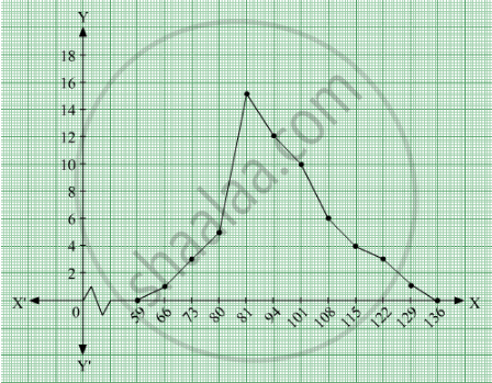
We first draw horizontal and vertical axes. Let us consider that the horizontal and vertical axes represent the class-limits and the frequencies of the class-intervals respectively.
The given data is a continuous grouped frequency distribution with equal class-intervals. To draw the frequency polygon of the given data without using histogram, obtain the class-limits of the class intervals. Obtain the class-limits of two class-intervals of 0 frequencies, i.e. on the horizontal axis, one adjacent to the first, on its left and one adjacent to the last, on its right. These class-intervals are known as imagined class-intervals. Then plot the frequencies against class-limits.
The following table is useful to draw the frequency polygon of the given data.
| Class - Intervals | Class - Marks | Frequency |
| 55.5-62.5 | 59 | 0 |
| 62.5-69.5 | ||
We represent class marks on X-axis on a suitable scale and the frequencies on Y-axis on a suitable scale.
To obtain the frequency polygon we plot the points (66, 1), (73, 3), (80, 5), (87, 15), (94, 12), (101, 10), (108, 6), (115, 4), (122, 3), (129, 1).
Now we join the plotted points by line segments. The end points (66, 1) and (129, 1) are joined to the mid points (59, 0) and ( 136, 0) respectively of imagined class intervals to obtain the frequency polygon.
Solution 2
We first draw horizontal and vertical axes. Let us consider that the horizontal and vertical axes represent the class-limits and the frequencies of the class-intervals respectively.
The given data is a continuous grouped frequency distribution with equal class-intervals. To draw the frequency polygon of the given data without using histogram, obtain the class-limits of the class intervals. Obtain the class-limits of two class-intervals of 0 frequencies, i.e. on the horizontal axis, one adjacent to the first, on its left and one adjacent to the last, on its right. These class-intervals are known as imagined class-intervals. Then plot the frequencies against class-limits.
The following table is useful to draw the frequency polygon of the given data.
| Class - Intervals | Class - Marks | Frequency |
| 55.5-62.5 | 59 | 0 |
| 62.5-69.5 | 66 | 1 |
| 69.5 - 76.5 | 73 | 3 |
| 76.5 - 83.5 | 80 | 5 |
| 83.5 - 90.5 | 87 | 15 |
| 90.5 - 97.5 | 94 | 12 |
| 97.5-104.5 | 101 | 10 |
| 104-111.5 | 108 | 6 |
| 111.5 - 118.5 | 115 | 4 |
| 118.5-125.5 | 122 | 3 |
| 125.5-132.5 | 129 | 1 |
| 132.5-139.5 | 136 | 0 |
We represent class marks on X-axis on a suitable scale and the frequencies on Y-axis on a suitable scale.
To obtain the frequency polygon we plot the points (66, 1), (73, 3), (80, 5), (87, 15), (94, 12), (101, 10), (108, 6), (115, 4), (122, 3), (129, 1).
Now we join the plotted points by line segments. The end points (66, 1) and (129, 1) are joined to the mid points (59, 0) and ( 136, 0) respectively of imagined class intervals to obtain the frequency polygon.
APPEARS IN
RELATED QUESTIONS
A random survey of the number of children of various age groups playing in a park was found as follows:
| Age (in years) | Number of children |
| 1 - 2 | 5 |
| 2 - 3 | 3 |
| 3 - 5 | 6 |
| 5 - 7 | 12 |
| 7 - 10 | 9 |
| 10 - 15 | 10 |
| 15 - 17 | 4 |
Draw a histogram to represent the data above.
Read the bar graph given in Fig. 23.21 and answer the following questions:
(i) What is the information given by the bar graph?
(ii) What is the number of families having 6 members?
(iii) How many members per family are there in the maximum number of families? Also tell the number of such families.
(iv) What are the number of members per family for which the number of families are equal? Also, tell the number of such families?
The following table shows the number of Maruti cars sold by five dealers in a particular month:
| Dealer: | Saya | Bagga Links | D.D. Motors | Bhasin Motors | Competent |
| Cars sold: | 60 | 40 | 20 | 15 | 10 |
Represent the above information by a pictograph.
The population of Delhi State in different census years is as given below:
| Census year | 1961 | 1971 | 1981 | 1991 | 2001 |
| Population in Lakhs | 30 | 55 | 70 | 110 | 150 |
The production of oil (in lakh tonnes) in some of the refineries in India during 1982 was given below:
| Refinery: | Barauni | Koyali | Mathura | Mumbai | Florida |
| Production of oil (in lakh tonnes) |
30 | 70 | 40 | 45 | 25 |
Construct a bar graph to represent the above data so that the bars are drawn horizontally.
The time taken, in seconds, to solve a problem by each of 25 pupils is as follows:
16, 20, 26, 27, 28, 30, 33, 37, 38, 40, 42, 43, 46, 46, 46, 48, 49, 50, 53, 58, 59, 60, 64, 52, 20
(a) Construct a frequency distribution for these data, using a class interval of 10 seconds.
(b) Draw a histogram to represent the frequency distribution.
In a histogram the area of each rectangle is proportional to
For the following data, draw a pie graph.
| Subject | Hindi | English | Maths | Science | Social Study |
| Marks as percent | 60 | 45 | 42 | 48 | 75 |
Draw a histogram to represent the following grouped frequency distribution:
| Ages (in years) | Number of teachers |
| 20 – 24 | 10 |
| 25 – 29 | 28 |
| 30 – 34 | 32 |
| 35 – 39 | 48 |
| 40 – 44 | 50 |
| 45 – 49 | 35 |
| 50 – 54 | 12 |
Following table shows a frequency distribution for the speed of cars passing through at a particular spot on a high way:
| Class interval (km/h) | Frequency |
| 30 – 40 | 3 |
| 40 – 50 | 6 |
| 50 – 60 | 25 |
| 60 – 70 | 65 |
| 70 – 80 | 50 |
| 80 – 90 | 28 |
| 90 – 100 | 14 |
Draw a histogram and frequency polygon representing the data above.
