Advertisements
Advertisements
प्रश्न
The following table gives the distribution of IQ's (intelligence quotients) of 60 pupils of class V in a school:
| IQ's: | 125.5 to 13.25 |
118.5 to 125.5 |
111.5 to 118.5 |
104.5 to 111.5 |
97.5 to 104.5 |
90.5 to 97.5 |
83.5 to 90.5 |
76.5 to 83.5 |
69.5 to 76.5 |
62.5 to 69.5 |
| No. of pupils: |
1 | 3 | 4 | 6 | 10 | 12 | 15 | 5 | 3 | 1 |
Draw a frequency polygon for the above data.
Advertisements
उत्तर १
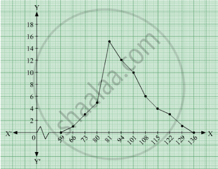
We first draw horizontal and vertical axes. Let us consider that the horizontal and vertical axes represent the class-limits and the frequencies of the class-intervals respectively.
The given data is a continuous grouped frequency distribution with equal class-intervals. To draw the frequency polygon of the given data without using histogram, obtain the class-limits of the class intervals. Obtain the class-limits of two class-intervals of 0 frequencies, i.e. on the horizontal axis, one adjacent to the first, on its left and one adjacent to the last, on its right. These class-intervals are known as imagined class-intervals. Then plot the frequencies against class-limits.
The following table is useful to draw the frequency polygon of the given data.
| Class - Intervals | Class - Marks | Frequency |
| 55.5-62.5 | 59 | 0 |
| 62.5-69.5 | ||
We represent class marks on X-axis on a suitable scale and the frequencies on Y-axis on a suitable scale.
To obtain the frequency polygon we plot the points (66, 1), (73, 3), (80, 5), (87, 15), (94, 12), (101, 10), (108, 6), (115, 4), (122, 3), (129, 1).
Now we join the plotted points by line segments. The end points (66, 1) and (129, 1) are joined to the mid points (59, 0) and ( 136, 0) respectively of imagined class intervals to obtain the frequency polygon.
उत्तर २
We first draw horizontal and vertical axes. Let us consider that the horizontal and vertical axes represent the class-limits and the frequencies of the class-intervals respectively.
The given data is a continuous grouped frequency distribution with equal class-intervals. To draw the frequency polygon of the given data without using histogram, obtain the class-limits of the class intervals. Obtain the class-limits of two class-intervals of 0 frequencies, i.e. on the horizontal axis, one adjacent to the first, on its left and one adjacent to the last, on its right. These class-intervals are known as imagined class-intervals. Then plot the frequencies against class-limits.
The following table is useful to draw the frequency polygon of the given data.
| Class - Intervals | Class - Marks | Frequency |
| 55.5-62.5 | 59 | 0 |
| 62.5-69.5 | 66 | 1 |
| 69.5 - 76.5 | 73 | 3 |
| 76.5 - 83.5 | 80 | 5 |
| 83.5 - 90.5 | 87 | 15 |
| 90.5 - 97.5 | 94 | 12 |
| 97.5-104.5 | 101 | 10 |
| 104-111.5 | 108 | 6 |
| 111.5 - 118.5 | 115 | 4 |
| 118.5-125.5 | 122 | 3 |
| 125.5-132.5 | 129 | 1 |
| 132.5-139.5 | 136 | 0 |
We represent class marks on X-axis on a suitable scale and the frequencies on Y-axis on a suitable scale.
To obtain the frequency polygon we plot the points (66, 1), (73, 3), (80, 5), (87, 15), (94, 12), (101, 10), (108, 6), (115, 4), (122, 3), (129, 1).
Now we join the plotted points by line segments. The end points (66, 1) and (129, 1) are joined to the mid points (59, 0) and ( 136, 0) respectively of imagined class intervals to obtain the frequency polygon.
APPEARS IN
संबंधित प्रश्न
Given below are the seats won by different political parties in the polling outcome of a state assembly elections:-
| Political Party | A | B | C | D | E | F |
| Seats Won | 75 | 55 | 37 | 29 | 10 | 37 |
- Draw a bar graph to represent the polling results.
- Which political party won the maximum number of seats?
Read the following bar graph and answer the following questions:

(i) What information is given by the bar graph?
(ii) Which state is the largest producer of rice?
(iii) Which state is the largest producer of wheat?
(iv) Which state has total production of rice and wheat as its maximum?
(v) Which state has the total production of wheat and rice minimum?
The following bar graph (Fig. 23. 1 4) represents the heights (in cm) of 50 students of Class XI of a particular school. Study the graph and answer the following questions:

(i) What percentage of the total number of students have their heights more than 149cm?
(ii) How many students in the class are in the range of maximum height of the class?
(iii) The school wants to provide a particular type of tonic to each student below the height
of 150 cm to improve his height. If the cost of the tonic for each student comes out to be Rs. 55, how much amount of money is required?
(iv) How many students are in the range of shortest height of the class?
(v) State whether true or false:
a. There are 9 students in the class whose heights are in the range of 155 - 159 cm.
b. Maximum height (in cm) of a student in the class is 17.
c. There are 29 students in the class whose heights are in the range of 145- 154 cm.
d. Minimum height (in cm) of a student is the class is in the range of 140 – 144 cms.
e. The number of students in the class having their heights less than 150 cm is 12.
f. There are 14 students each of whom has height more than 154. cm.
Read the bar graph given in Fig. 23.19 and answer the following questions:
(i) What information is given by the bar graph?

(ii) In which years the areas under the sugarcane crop were the maximum and the minimum?
(iii) State whether true or false:
The area under the sugarcane crop in the year 1982 - 83 is three times that of the year 1950 - 51
Read the bar graph given in Fig. 23.20 and answer the fol1owing questions:

(i) What information is given by the bar graph?
(ii) What was the expenditure on health and family planning in the year 1982-83?
(iii) In which year is the increase in expenditure maximum over the expenditure in previous year? What is the maximum increase?
The following table shows the number of Maruti cars sold by five dealers in a particular month:
| Dealer: | Saya | Bagga Links | D.D. Motors | Bhasin Motors | Competent |
| Cars sold: | 60 | 40 | 20 | 15 | 10 |
Represent the above information by a pictograph.
The following data gives the production of foodgrains (in thousand tonnes) for some years:
| Year | 1995 | 1996 | 1997 | 1998 | 1999 | 2000 |
| Production (in thousand tonnes |
120 | 150 | 140 | 180 | 170 | 190 |
Represent the above with the help of a bar graph.
The following tables gives the quantity of goods (in crore tonnes)
| Year | 1950-51 | 1960-61 | 1965-66 | 1970-71 | 1980-81 | 1982-83 |
| Quantity of Goods (in crore tonnes) |
9 | 16 | 20 | 20 | 22 | 26 |
Explain through the bar graph if the quantity of goods carried by the Indian Railways in 1965-66 is more than double the quantity of goods carried in the year 1950-51.
The following tables show the mode of transport used by boys and girls for going to the same school.
| Bus | Bicycle | Walking | Other sources | |
|
Number of boys |
80 | 60 | 20 | 85 |
|
Number of girls |
90 | 75 | 35 | 60 |
Draw a double bar graph representing the above data.
Mr. Kapoor compares the prices (in Rs.) of different items at two different shops A and B. Examine the following table carefully and represent the data by a double bar graph.
| Items | Price (in ₹) at the shop A | Price (in ₹) at the shop B |
|
Tea-set |
900 | 950 |
|
Mixie |
700 | 800 |
|
Coffee-maker |
600 | 700 |
|
Dinner set |
600 | 500 |
