Advertisements
Advertisements
प्रश्न
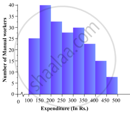
The following is the distribution of total household expenditure (in Rs.) of manual worker in a city:
| Expenditure (in Rs): |
100-150 | 150-200 | 200-250 | 250-300 | 300-350 | 350-400 | 400-450 | 450-500 |
| No. of manual workers: | 25 | 40 | 33 | 28 | 30 | 22 | 16 | 8 |
Draw a histogram and a frequency polygon representing the above data.
Advertisements
उत्तर
To represent the given data by a histogram, we first draw horizontal and vertical axes. Let us consider that the horizontal and vertical axes represent the class-limits and the frequencies of the class-intervals respectively.
The given data is a continuous grouped frequency distribution with equal class-intervals. Construct rectangles with class-intervals as bases and respective frequencies as heights. It should be noted that the scale for horizontal axis may not be same as the scale for vertical axis. To draw the frequency polygon of the given data using histogram, obtain the mid-points of the upper horizontal side of each rectangle and then join these mid-points of the adjacent rectangles of the histogram by line segments. Obtain the mid-points of two class-intervals of 0 frequencies, i.e. on the horizontal axis, one adjacent to the first, on its left and one adjacent to the last, on its right. These class-intervals are known as imagined class-intervals. Complete the polygon by joining the mid-points of first and last class-intervals to the mid-points of imagined class-intervals adjacent to them. Let us take one vertical division is equal to 5 workers.
The heights of the different rectangles are as follows:
1. The height of the rectangle corresponding to the class-interval 100-150 is `25/5=5` big divisions.
2. The height of the rectangle corresponding to the class-interval 150-200 is `40/5=8` big divisions.
3. The height of the rectangle corresponding to the class-interval 200-250 is ` 33/5 = 6.6` big divisions.
4. The height of the rectangle corresponding to the class-interval 250-300 is `28/5 = 5.6 ` big divisions.
5. The height of the rectangle corresponding to the class-interval 300-350 is ` 30/5 =6 ` big divisions.
6. The height of the rectangle corresponding to the class-interval 350-400 is ` 22/5 = 4.4` big divisions.
7. The height of the rectangle corresponding to the class-interval 400-450 is ` 16/5 = 3.2` big division.
8. The height of the rectangle corresponding to the class-interval 450-500 is ` 8/5 = 1.6` big divisions.
The histogram of the given data is as follows:
APPEARS IN
संबंधित प्रश्न
The following table gives the distribution of students of two sections according to the mark obtained by them:-
| Section A | Section B | ||
| Marks | Frequency | Marks | Frequency |
| 0 - 10 | 3 | 0 - 10 | 5 |
| 10 - 20 | 9 | 10 - 20 | 19 |
| 20 - 30 | 17 | 20 - 30 | 15 |
| 30 - 40 | 12 | 30 - 40 | 10 |
| 40 - 50 | 9 | 40 - 50 | 1 |
Represent the marks of the students of both the sections on the same graph by two frequency polygons. From the two polygons compare the performance of the two sections.
Read the following bar graph (Fig. 23.12) and answer the following questions:
(i) What is the information given by the bar graph?
(ii) State each of the following whether true or false.
a. The number of government companies in 1957 is that of 1982 is 1 :9.
b. The number of government companies have decreased over the year 1957 to 1983.

Read the following bar graph and answer the following questions:

(i) What information is given by the bar graph?
(ii) Which state is the largest producer of rice?
(iii) Which state is the largest producer of wheat?
(iv) Which state has total production of rice and wheat as its maximum?
(v) Which state has the total production of wheat and rice minimum?
The following table shows the interest paid by a company (in lakhs):
| Year | 1995-96 | 1996-97 | 1997-98 | 1998-99 | 1999-2000 |
| Interest (in lakhs of rupees | 20 | 25 | 15 | 18 | 30 |
Draw the bar graph to represent the above information.
The income and expenditure for 5 years of a family is given in the following data:
| Years | 1995-96 | 1996-97 | 1997-98 | 1998-99 | 1999-2000 |
| Income (Rs. inthousands) |
100 | 140 | 150 | 170 | 210 |
| Expenditure (Rs. in thousands) |
80 | 130 | 145 | 160 | 190 |
Represent the above data by a gar graph.
Which one of the following is not the graphical representation of statistical data:
Construct a combined histogram and frequency polygon for the following frequency distribution:
| Class-Intervals | 10 - 20 | 20 - 30 | 30 - 40 | 40 - 50 | 50 - 60 |
| Frequency | 3 | 5 | 6 | 4 | 2 |
The following table shows the market position of different brands of tea-leaves.
| Brand | A | B | C | D | others |
| % of Buyers | 35 | 20 | 20 | 15 | 10 |
Draw it-pie-chart to represent the above information.
In a diagnostic test in mathematics given to students, the following marks (out of 100) are recorded:
46, 52, 48, 11, 41, 62, 54, 53, 96, 40, 98, 44
Which ‘average’ will be a good representative of the above data and why?
The expenditure of a family on different heads in a month is given below:
| Head | Food | Education | Clothing | House Rent | Others | Savings |
| Expenditure (in Rs) |
4000 | 2500 | 1000 | 3500 | 2500 | 1500 |
Draw a bar graph to represent the data above.
