Advertisements
Advertisements
प्रश्न
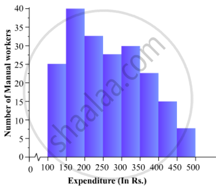
The following is the distribution of total household expenditure (in Rs.) of manual worker in a city:
| Expenditure (in Rs): |
100-150 | 150-200 | 200-250 | 250-300 | 300-350 | 350-400 | 400-450 | 450-500 |
| No. of manual workers: | 25 | 40 | 33 | 28 | 30 | 22 | 16 | 8 |
Draw a histogram and a frequency polygon representing the above data.
Advertisements
उत्तर
To represent the given data by a histogram, we first draw horizontal and vertical axes. Let us consider that the horizontal and vertical axes represent the class-limits and the frequencies of the class-intervals respectively.
The given data is a continuous grouped frequency distribution with equal class-intervals. Construct rectangles with class-intervals as bases and respective frequencies as heights. It should be noted that the scale for horizontal axis may not be same as the scale for vertical axis. To draw the frequency polygon of the given data using histogram, obtain the mid-points of the upper horizontal side of each rectangle and then join these mid-points of the adjacent rectangles of the histogram by line segments. Obtain the mid-points of two class-intervals of 0 frequencies, i.e. on the horizontal axis, one adjacent to the first, on its left and one adjacent to the last, on its right. These class-intervals are known as imagined class-intervals. Complete the polygon by joining the mid-points of first and last class-intervals to the mid-points of imagined class-intervals adjacent to them. Let us take one vertical division is equal to 5 workers.
The heights of the different rectangles are as follows:
1. The height of the rectangle corresponding to the class-interval 100-150 is `25/5=5` big divisions.
2. The height of the rectangle corresponding to the class-interval 150-200 is `40/5=8` big divisions.
3. The height of the rectangle corresponding to the class-interval 200-250 is ` 33/5 = 6.6` big divisions.
4. The height of the rectangle corresponding to the class-interval 250-300 is `28/5 = 5.6 ` big divisions.
5. The height of the rectangle corresponding to the class-interval 300-350 is ` 30/5 =6 ` big divisions.
6. The height of the rectangle corresponding to the class-interval 350-400 is ` 22/5 = 4.4` big divisions.
7. The height of the rectangle corresponding to the class-interval 400-450 is ` 16/5 = 3.2` big division.
8. The height of the rectangle corresponding to the class-interval 450-500 is ` 8/5 = 1.6` big divisions.
The histogram of the given data is as follows:
APPEARS IN
संबंधित प्रश्न
The following table gives the life times of 400 neon lamps:-
| Life time (in hours) | Number of lamps |
| 300 - 400 | 14 |
| 400 - 500 | 56 |
| 500 - 600 | 60 |
| 600 - 700 | 86 |
| 700 - 800 | 74 |
| 800 - 900 | 62 |
| 900 - 1000 | 48 |
- Represent the given information with the help of a histogram.
- How many lamps have a life time of more than 700 hours?
Read the bar graph given in Fig. 23.22 and answer the following questions:

(i) What information is given by the bar graph?
(ii) Which Doordarshan centre covers maximum area? Also tell the covered area.
(iii) What is the difference between the areas covered by the centres at delhi and Bombay?
(iv) Which Doordarshan centres are in U.P State? What are the areas covered by them?
The production of oil (in lakh tonnes) in some of the refineries in India during 1982 was given below:
| Refinery: | Barauni | Koyali | Mathura | Mumbai | Florida |
| Production of oil (in lakh tonnes) |
30 | 70 | 40 | 45 | 25 |
Construct a bar graph to represent the above data so that the bars are drawn horizontally.
The following table gives the distribution of IQ's (intelligence quotients) of 60 pupils of class V in a school:
| IQ's: | 125.5 to 13.25 |
118.5 to 125.5 |
111.5 to 118.5 |
104.5 to 111.5 |
97.5 to 104.5 |
90.5 to 97.5 |
83.5 to 90.5 |
76.5 to 83.5 |
69.5 to 76.5 |
62.5 to 69.5 |
| No. of pupils: |
1 | 3 | 4 | 6 | 10 | 12 | 15 | 5 | 3 | 1 |
Draw a frequency polygon for the above data.
In a histogram the class intervals or the group are taken along
A histogram is a pictorial representation of the grouped data in which class intervals and frequency are respectively taken along
The following tables show the mode of transport used by boys and girls for going to the same school.
| Bus | Bicycle | Walking | Other sources | |
|
Number of boys |
80 | 60 | 20 | 85 |
|
Number of girls |
90 | 75 | 35 | 60 |
Draw a double bar graph representing the above data.
In a diagnostic test in mathematics given to students, the following marks (out of 100) are recorded:
46, 52, 48, 11, 41, 62, 54, 53, 96, 40, 98, 44
Which ‘average’ will be a good representative of the above data and why?
Following table shows a frequency distribution for the speed of cars passing through at a particular spot on a high way:
| Class interval (km/h) | Frequency |
| 30 – 40 | 3 |
| 40 – 50 | 6 |
| 50 – 60 | 25 |
| 60 – 70 | 65 |
| 70 – 80 | 50 |
| 80 – 90 | 28 |
| 90 – 100 | 14 |
Draw the frequency polygon representing the above data without drawing the histogram.
Following table gives the distribution of students of sections A and B of a class according to the marks obtained by them.
| Section A | Section B | ||
| Marks | Frequency | Marks | Frequency |
| 0 – 15 | 5 | 0 – 15 | 3 |
| 15 – 30 | 12 | 15 – 30 | 16 |
| 30 – 45 | 28 | 30 – 45 | 25 |
| 45 – 60 | 30 | 45 – 60 | 27 |
| 60 –75 | 35 | 60 – 75 | 40 |
| 75 – 90 | 13 | 75 – 90 | 10 |
Represent the marks of the students of both the sections on the same graph by two frequency polygons. What do you observe?
