Advertisements
Advertisements
प्रश्न
Following table gives the distribution of students of sections A and B of a class according to the marks obtained by them.
| Section A | Section B | ||
| Marks | Frequency | Marks | Frequency |
| 0 – 15 | 5 | 0 – 15 | 3 |
| 15 – 30 | 12 | 15 – 30 | 16 |
| 30 – 45 | 28 | 30 – 45 | 25 |
| 45 – 60 | 30 | 45 – 60 | 27 |
| 60 –75 | 35 | 60 – 75 | 40 |
| 75 – 90 | 13 | 75 – 90 | 10 |
Represent the marks of the students of both the sections on the same graph by two frequency polygons. What do you observe?
Advertisements
उत्तर
Firstly, we find the mid marks of the given sections A and B by using the formula
Class mark = `("Lower limit" + "Upper limit")/2`
So, the new table for section A and section B is shown below:
| Section A | Section B | ||||
| Marks | Mid marks | Frequency | Marks | Mid marks | Frequency |
| 0 – 15 | 7.5 | 5 | 0 – 15 | 7.5 | 3 |
| 15 – 30 | 22.5 | 12 | 15 – 30 | 22.5 | 16 |
| 30 – 45 | 37.5 | 28 | 30 – 45 | 37.5 | 25 |
| 45 – 60 | 52.5 | 30 | 45 – 60 | 52.5 | 27 |
| 60 –75 | 67.5 | 35 | 60 – 75 | 67.5 | 40 |
| 75 – 90 | 82.5 | 13 | 75 – 90 | 82.5 | 10 |
We can draw a frequency polygon by plotting the class marks along the horizontal axis and the frequency along the vertical axis.
Now, plotting all the points A(7.5, 5), B(22.5, 12), C(37.5, 28), D(52.5, 30), E(67.5, 35), (F(82.5, 13) for section A.
Also, plotting all the points H(7.5, 3), I(22.5, 16), J(37.5, 25), K(52.5, 27), L(67.5, 40) and M(82.5, 10) for section B.
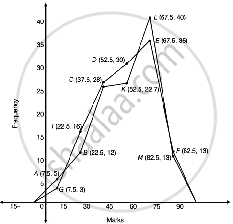
It is clear from the graph that maximum marks 67.5 score by 40 students in section B.
APPEARS IN
संबंधित प्रश्न
Given below (Fig. below) is the bar graph indicating the marks obtained out of 50 in mathematics paper by 100 students. Read the bar graph and answer the following questions:
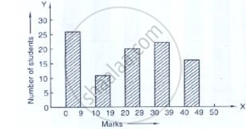
(i) It is decided to distribute work books on mathematics to the students obtaining less than 20 marks, giving one workbook to each of such students. If a work book
costs Rs 5, what sum is required to buy the work books?
(ii) Every student belonging to the highest mark group is entitled to get a prize of Rs. 10. How much amount of money is required for distributing the prize money?
(iii) Every student belonging to the lowest mark—group has to solve 5 problems per day. How many problems, in all, will be solved by the students of this group per day?
(iv) State whether true or false.
a. 17% students have obtained marks ranging from 40 to 49.
b. 59 students have obtained marks ranging from 10 to 29.
(v) What is the number of students getting less than 20 marks?
(vi) What is the number of students getting more than 29 marks?
(vii) What is the number of students getting marks between 9 and 40?
(viii) What is the number of students belonging to the highest mark group?
(ix) What is the number of students obtaining more than 19 marks?
The following table shows the daily production of T. V. sets in an industry for 7 days of a week:
| Day | Mon | Tue | Wed | Thurs | Fri | Sat | Sun |
| Number of T.V. Sets | 300 | 400 | 150 | 250 | 100 | 350 | 200 |
Represent the above information by a pictograph .
The population of Delhi State in different census years is as given below:
| Census year | 1961 | 1971 | 1981 | 1991 | 2001 |
| Population in Lakhs | 30 | 55 | 70 | 110 | 150 |
The following data gives the production of foodgrains (in thousand tonnes) for some years:
| Year | 1995 | 1996 | 1997 | 1998 | 1999 | 2000 |
| Production (in thousand tonnes |
120 | 150 | 140 | 180 | 170 | 190 |
Represent the above with the help of a bar graph.
The production of oil (in lakh tonnes) in some of the refineries in India during 1982 was given below:
| Refinery: | Barauni | Koyali | Mathura | Mumbai | Florida |
| Production of oil (in lakh tonnes) |
30 | 70 | 40 | 45 | 25 |
Construct a bar graph to represent the above data so that the bars are drawn horizontally.
The distribution of heights (in cm) of 96 children is given below. Construct a histogram and a frequency polygon on the same axes.
| Height (in cm): | 124 to 128 |
128 to 132 |
132 to 136 |
136 to 140 |
140 to 144 |
144 to 148 |
148 to 152 |
152 to 156 |
156 to 160 |
160 to 164 |
| No. of Children: | 5 | 8 | 17 | 24 | 16 | 12 | 6 | 4 | 3 | 1 |
The following is the distribution of total household expenditure (in Rs.) of manual worker in a city:
| Expenditure (in Rs): |
100-150 | 150-200 | 200-250 | 250-300 | 300-350 | 350-400 | 400-450 | 450-500 |
| No. of manual workers: | 25 | 40 | 33 | 28 | 30 | 22 | 16 | 8 |
Draw a histogram and a frequency polygon representing the above data.
Draw a histogram for the daily earnings of 30 drug stores in the following table:
| Daily earning (in Rs): |
450-500 | 500-550 | 550-600 | 600-650 | 650-700 |
| Number of Stores: | 16 | 10 | 7 | 3 | 1 |
In a histogram, each class rectangle is constructed with base as
Expenditure on Education of a country during a five year period (2002-2006), in crores of rupees, is given below:
| Elementary education | 240 |
| Secondary Education | 120 |
| University Education | 190 |
| Teacher’s Training | 20 |
| Social Education | 10 |
| Other Educational Programmes | 115 |
| Cultural programmes | 25 |
| Technical Education | 125 |
Represent the information above by a bar graph.
