Advertisements
Advertisements
प्रश्न
Following table gives the distribution of students of sections A and B of a class according to the marks obtained by them.
| Section A | Section B | ||
| Marks | Frequency | Marks | Frequency |
| 0 – 15 | 5 | 0 – 15 | 3 |
| 15 – 30 | 12 | 15 – 30 | 16 |
| 30 – 45 | 28 | 30 – 45 | 25 |
| 45 – 60 | 30 | 45 – 60 | 27 |
| 60 –75 | 35 | 60 – 75 | 40 |
| 75 – 90 | 13 | 75 – 90 | 10 |
Represent the marks of the students of both the sections on the same graph by two frequency polygons. What do you observe?
Advertisements
उत्तर
Firstly, we find the mid marks of the given sections A and B by using the formula
Class mark = `("Lower limit" + "Upper limit")/2`
So, the new table for section A and section B is shown below:
| Section A | Section B | ||||
| Marks | Mid marks | Frequency | Marks | Mid marks | Frequency |
| 0 – 15 | 7.5 | 5 | 0 – 15 | 7.5 | 3 |
| 15 – 30 | 22.5 | 12 | 15 – 30 | 22.5 | 16 |
| 30 – 45 | 37.5 | 28 | 30 – 45 | 37.5 | 25 |
| 45 – 60 | 52.5 | 30 | 45 – 60 | 52.5 | 27 |
| 60 –75 | 67.5 | 35 | 60 – 75 | 67.5 | 40 |
| 75 – 90 | 82.5 | 13 | 75 – 90 | 82.5 | 10 |
We can draw a frequency polygon by plotting the class marks along the horizontal axis and the frequency along the vertical axis.
Now, plotting all the points A(7.5, 5), B(22.5, 12), C(37.5, 28), D(52.5, 30), E(67.5, 35), (F(82.5, 13) for section A.
Also, plotting all the points H(7.5, 3), I(22.5, 16), J(37.5, 25), K(52.5, 27), L(67.5, 40) and M(82.5, 10) for section B.
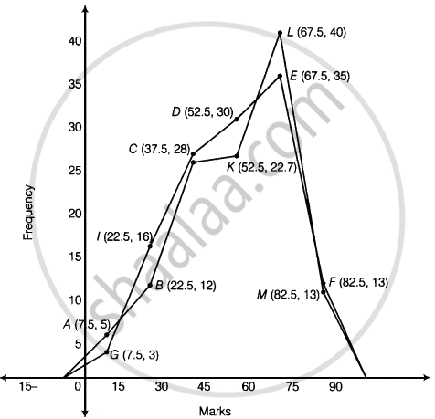
It is clear from the graph that maximum marks 67.5 score by 40 students in section B.
APPEARS IN
संबंधित प्रश्न
The following table gives the life times of 400 neon lamps:-
| Life time (in hours) | Number of lamps |
| 300 - 400 | 14 |
| 400 - 500 | 56 |
| 500 - 600 | 60 |
| 600 - 700 | 86 |
| 700 - 800 | 74 |
| 800 - 900 | 62 |
| 900 - 1000 | 48 |
- Represent the given information with the help of a histogram.
- How many lamps have a life time of more than 700 hours?
Read the following bar graph(Fig. 23.15) and answer the following questions:
(i) What information is given by the bar graph?
(ii) What was the production of a student in the year 1980 - 81?
(iii) What is the minimum and maximum productions of cement and corresponding years?

The following data gives the number (in thousands) of applicants registered with an
| Year | 1995 | 1996 | 1997 | 1998 | 1999 | 2000 |
| Number of applicants registered (in thousands) | 18 | 20 | 24 | 28 | 30 | 34 |
Construct a bar graph to represent the above data.

In a histogram the area of each rectangle is proportional to
Construct a frequency polygon for the following distribution:
| Class-intervals | 0-4 | 4 - 8 | 8 - 12 | 12 - 16 | 16 - 20 | 20 - 24 |
| Frequency | 4 | 7 | 10 | 15 | 11 | 6 |
The number of students (boys and girls) of class IX participating in different activities during their annual day function is given below:
| Activities | Dance | Speech | Singing | Quiz | Drama | Anchoring |
| Boys | 12 | 5 | 4 | 4 | 10 | 2 |
| Girls | 10 | 8 | 6 | 3 | 9 | 1 |
Draw a double bar graph for the above data.
Is it correct to say that in a histogram, the area of each rectangle is proportional to the class size of the corresponding class interval? If not, correct the statement.
In the following figure, there is a histogram depicting daily wages of workers in a factory. Construct the frequency distribution table.

The marks obtained (out of 100) by a class of 80 students are given below:
| Marks | Number of students |
| 10 – 20 | 6 |
| 20 – 30 | 17 |
| 30 – 50 | 15 |
| 50 – 70 | 16 |
| 70 – 100 | 26 |
Construct a histogram to represent the data above.
Following table shows a frequency distribution for the speed of cars passing through at a particular spot on a high way:
| Class interval (km/h) | Frequency |
| 30 – 40 | 3 |
| 40 – 50 | 6 |
| 50 – 60 | 25 |
| 60 – 70 | 65 |
| 70 – 80 | 50 |
| 80 – 90 | 28 |
| 90 – 100 | 14 |
Draw the frequency polygon representing the above data without drawing the histogram.
