Advertisements
Advertisements
Question
The bar graph given below shows the marks of students of a class in a particular subject:

Study the bar graph and answer the following questions:
- If 40 is the pass mark, then how many students have failed?
- How many students got marks from 50 to 69?
- How many students scored 90 marks and above?
- If students who scored marks above 80 are given merits then how many merit holders are there?
- What is the strength of the class?
Advertisements
Solution
a. If 40 is the pass marks, then students who got marks less than 40 will be failed.
∴ Number of students who failed = 4
b. Number of students who got marks from 50 to 69
= Number of students who got marks from 50 to 59 + Number of students who got marks from 60 to 69
= 7 + 11
= 18
c. Number of students scored 90 marks and above
= Number of students who scored marks 90 to 92
= 4
d. Number of students who scored marks above 80
= Number of students who score 80 to 89 + Number of students who score 90 to 92
= 6 + 4
= 10
Since, students who scored marks above 80 are given merits.
∴ Number of students who are merit holders = 10
e. Strength of the class = Total number of students who scored different marks
= 4 + 2 + 7 + 11 + 8 + 6 + 4
= 42
APPEARS IN
RELATED QUESTIONS
The performance of students in 1st Term and 2nd Term is given. Draw a double bar graph choosing appropriate scale and answer the following:
| Subject | English | Hindi | Maths | Science | S. science |
| 1st Term (M.M. 100) | 67 | 72 | 88 | 81 | 73 |
| 2nd Term (M.M. 100) | 70 | 65 | 95 | 85 | 75 |
- In which subject, has the child improved his performance the most?
- In which subject is the improvement the least?
- Has the performance gone down in any subject?
Plot the points (2, 8), (7, 8) and (12, 8). Join these points in pairs. Do they lie on a line? What do you observe?
Practice time: Afterschool
Ask 10 of your friends about what they like to do most after school.
| What they like to do after school |
Number of children |
| Watching TV | |
| Playing football | |
| Reading storybooks | |
Try yourself
On any one day, choose any three cities and record their temperature from the TV or newspaper.
- Make a bar chart in your notebook and ask your friends a few questions about it. See if they understand your chart!
Use the bar graph (see the given figure) to answer the following question.

How many students have dog as a pet?
Read the bar graph given below and answer the following questions:
Scale: 1 unit = 50 students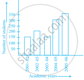
- What information is given by the bar graph?
- In which year is the number of students maximum?
- In which year is the number of students twice as that of 2001 – 02?
- In which year did the number of students decrease as compared to previous year?
- In which year is the increase in number of students maximum as compared to the previous year?
______ can be used to compare two collections of data.
Study the double bar graphs given below and answer the following questions:

- Which sport is liked the most by Class VIII students?
- How many students of Class VII like Hockey and Tennis in all?
- How many students are there in Class VII?
- For which sport is the number of students of Class VII less than that of Class VIII?
- For how many sports students of Class VIII are less than Class VII?
- Find the ratio of students who like Badminton in Class VII to students who like Tennis in Class VIII.
In a public library, the following observations were recorded by the librarian in a particular week:
| Days | Mon | Tues | Wed | Thurs | Fri | Sat |
| Newspaper Readers |
400 | 600 | 350 | 550 | 500 | 350 |
| Magazines Readers |
150 | 100 | 200 | 300 | 250 | 200 |
- Draw a double bar graph choosing an appropriate scale.
- On which day, the number of readers in the library was maximum?
- What is the mean number of magazine readers?
The table below gives the data of tourists visiting 5 hill stations over two consecutive years. Study the table and answer the questions that follow:
| Hill stations | Nainital | Shimla | Manali | Mussoorie | Kullu |
| 2008 | 4000 | 5200 | 3700 | 5800 | 3500 |
| 2009 | 4800 | 4500 | 4200 | 6200 | 4600 |
- Draw a double bar graph to depict the above information using appropriate scale.
- Which hill station was visited by the maximum number of tourists in 2008?
- Which hill station was visited by the least number of tourists in 2009?
- In which hill stations was there increase in number of tourists in the year 2009?
