Advertisements
Advertisements
प्रश्न
Construct a frequency polygon without using a histogram for the following frequency distribution :
| Class Interval | 1-10 | 11-20 | 21-30 | 31-40 | 41-50 |
| Frequency | 8 | 12 | 10 | 16 | 6 |
Advertisements
उत्तर
Steps :
1. Make the class intervals continuous by subtracting 0.5 from the lower limit of each class and add 0.5 to the upper limit of each class .
2. Find class mark by calculating the average of the class interval.
3. On the x-axis , take 1 cm as 5 units and plot class interval.
4. On the y-axis , take 1 cm as 5 units and plot frequency.
5. Plot the points on the graph. (5.5,8),(15.5,12),(25.5,10),(35.5,16),(45.5,6).
6. Mark two more midpoints of zero frequency on x-axis at the start and at the end.
7. Now connect the points using straight lines.
| Class Interval | Class Mark | Frequency |
| 0.5-10.5 | = `(0.5+10.5)/2 = 5.5` | 8 |
| 10.5-20.5 | = `(10.5+20.5)/2 = 15.5` | 12 |
| 20.5-30.5 | = `(20.5 + 30.5)/2 = 25.5` | 10 |
| 30.5-40.5 | = `(30.5 + 40.5)/2 = 35.5` | 16 |
| 40.5-50.5 | = `(40.5 + 50.5)/2 = 45.5` | 6 |

APPEARS IN
संबंधित प्रश्न
The weekly wages (in Rs) of 30 workers in a factory are.
830, 835, 890, 810, 835, 836, 869, 845, 898, 890, 820, 860, 832, 833, 855, 845, 804, 808, 812, 840, 885, 835, 835, 836, 878, 840, 868, 890, 806, 840
Using tally marks make a frequency table with intervals as 800 − 810, 810 − 820 and so on.
Given below is the frequency distribution of the heights of 50 students of a class:
| Class interval: | 140−145 | 145−150 | 150−155 | 155−160 | 160−165 |
| Frequency: | 8 | 12 | 18 | 10 | 5 |
Draw a histogram representing the above data.
Draw a histogram of the following data:
| Class interval: | 10−15 | 15−20 | 20−25 | 25−30 | 30−35 | 34−40 |
| Frequency: | 30 | 98 | 80 | 58 | 29 | 50 |
Distribution of height in cm of 100 people is given below:
| Class interval (cm) | Frequency |
| 145 - 155 | 3 |
| 155 - 165 | 35 |
| 165 - 175 | 25 |
| 175 - 185 | 15 |
| 185 - 195 | 20 |
| 195 - 205 | 2 |
Draw a histogram to represent the above data.
The total area of the histogram is _________ to the total frequency of the given data
Histogram is a graphical representation of ___________ data
Construct a histogram from the following distribution of total marks of 40 students in a class.
| Marks | 90 − 110 | 110 − 130 | 130 − 150 | 150 − 170 | 170 − 190 | 190 − 210 |
| No. of Students | 9 | 5 | 10 | 7 | 4 | 6 |
Histogram shows the number of people owning the different number of books. Answer the question based on it.
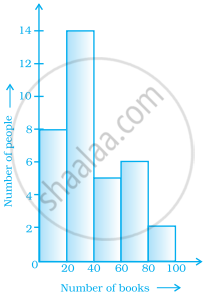
The total number of people surveyed is ______.
In a histogram, class intervals and frequencies are taken along ______ axis and ______ axis.
The table given below shows the runs scored by a cricket team during the overs of a match.
| Overs | Runs scored |
| 20 – 30 | 37 |
| 30 – 40 | 45 |
| 40 – 50 | 40 |
| 50 – 60 | 60 |
| 60 – 70 | 51 |
| 70 – 80 | 35 |
Use graph sheet for this question.
Take 2 cm = 10 overs along one axis and 2 cm = 10 runs along the other axis.
- Draw a histogram representing the above distribution.
- Estimate the modal runs scored.
