Advertisements
Advertisements
प्रश्न
Construct a frequency polygon without using a histogram for the following frequency distribution :
| Class Interval | 1-10 | 11-20 | 21-30 | 31-40 | 41-50 |
| Frequency | 8 | 12 | 10 | 16 | 6 |
Advertisements
उत्तर
Steps :
1. Make the class intervals continuous by subtracting 0.5 from the lower limit of each class and add 0.5 to the upper limit of each class .
2. Find class mark by calculating the average of the class interval.
3. On the x-axis , take 1 cm as 5 units and plot class interval.
4. On the y-axis , take 1 cm as 5 units and plot frequency.
5. Plot the points on the graph. (5.5,8),(15.5,12),(25.5,10),(35.5,16),(45.5,6).
6. Mark two more midpoints of zero frequency on x-axis at the start and at the end.
7. Now connect the points using straight lines.
| Class Interval | Class Mark | Frequency |
| 0.5-10.5 | = `(0.5+10.5)/2 = 5.5` | 8 |
| 10.5-20.5 | = `(10.5+20.5)/2 = 15.5` | 12 |
| 20.5-30.5 | = `(20.5 + 30.5)/2 = 25.5` | 10 |
| 30.5-40.5 | = `(30.5 + 40.5)/2 = 35.5` | 16 |
| 40.5-50.5 | = `(40.5 + 50.5)/2 = 45.5` | 6 |

APPEARS IN
संबंधित प्रश्न
Draw a histogram for the frequency table made for the data in Question 3 and answer the following questions.
(1) Which group has the maximum number of workers?
(2) How many workers earn Rs 850 and more?
(3) How many workers earn less than Rs 850?
Draw a histogram of the following data:
| Class interval: | 10−15 | 15−20 | 20−25 | 25−30 | 30−35 | 34−40 |
| Frequency: | 30 | 98 | 80 | 58 | 29 | 50 |
Below is the histogram depicting marks obtained by 43 students of a class:
(i) Write the number of students getting the highest marks.
(ii) What is the class size?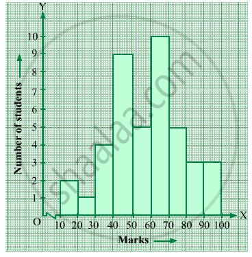
Draw a histogram for the following frequency distribution.
|
Use of electricity (Unit)
|
50 - 70 | 70 - 90 | 90 - 110 | 110 - 130 | 130 - 150 | 150 - 170 |
| No. of families | 150 | 400 | 460 | 540 | 600 | 350 |
Draw the Histogram and hence, the frequency polygon for the following frequency distribution:
| House Rent (In ₹ per month) | 400-600 | 600-800 | 800-1000 | 1000-1200 |
| Number of families | 200 | 240 | 300 | 50 |
The marks scored by students in Mathematics in a certain examination are given below :
| Marks Scored | Number of Students |
| 0 - 20 | 6 |
| 20 - 40 | 9 |
| 40 - 60 | 14 |
| 60 - 80 | 16 |
| 80 - 100 | 5 |
Draw histogram for the above data.
Draw the histogram for the following frequency distribution and hence estimate the mode for the distribution.
| Class | Frequency |
| 0 - 5 | 2 |
| 5 - 10 | 7 |
| 10 - 15 | 18 |
| 15 - 20 | 10 |
| 20 - 25 | 8 |
| 25 - 30 | 5 |
| Total | 24 |
Draw a histogram for the given frequency distribution
| Age | 41 − 45 | 46 − 50 | 51 − 55 | 56 − 60 | 61 − 65 | 66 − 70 | 71 − 75 |
| Frequency | 4 | 9 | 17 | 25 | 15 | 8 | 2 |
The following pictorial representation of data is a histogram.

Draw a histogram to represent the frequency distribution in question 91.
