Advertisements
Advertisements
प्रश्न
Construct a frequency polygon without using a histogram for the following frequency distribution :
| Class Interval | 10-20 | 20-40 | 40-60 | 60-80 | 80-100 |
| Frequency | 9 | 17 | 15 | 20 | 14 |
Advertisements
उत्तर
Steps :
1. Find class mark by calculating the average of the class interval.
2. On the x-axis , take 1 cm as 5 units and plot class interval.
3. On the y-axis , take 1 cm as 5 units and plot frequency.
4. plot the points on the graph. (15,9),(30,17),(50,15),(70,20),(90,14).
5. Mark two more midpoints of zero frequency on x-axis at the start and at the end .
6. Now connect the points using staright lines.
| Class Interval | Class mark | Frequency |
| 10-20 | `= (10+20)/2 = 15` | 9 |
| 20-40 | `= (20+40)/2 = 30` | 17 |
| 40-60 | `= (40+60)/2 = 50` | 15 |
| 60-80 | `= (60 + 80)/2 = 70` | 20 |
| 80-100 | `= (80 + 100)/2 = 90` | 14 |

APPEARS IN
संबंधित प्रश्न
The age groups and the number of persons in the age groups, who donated blood in blood donation camp is given below. Find the measures of central angles to show the information by a pie diagram.
| Age group (Years) | 20-25 | 25-30 | 30-35 | 35-40 |
| No of persons | 80 | 60 | 35 | 25 |
Given below is the frequency distribution of the heights of 50 students of a class:
| Class interval: | 140−145 | 145−150 | 150−155 | 155−160 | 160−165 |
| Frequency: | 8 | 12 | 18 | 10 | 5 |
Draw a histogram representing the above data.
The following histogram shows the number of literate females in the age group of 10 to 40 years in a town: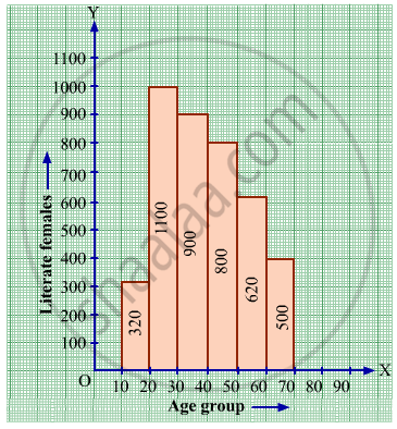
(i) Write the age group in which the number of literate female is the highest.
(ii) What is the class width?
(iii) What is the lowest frequency?
(iv) What are the class marks of the classes?
(v) In which age group literate females are the least?
Find the lower quartile, the upper quartile, the interquartile range and the semi-interquartile range for the following frequency distributions:
| Variate | 10 | 11 | 12 | 13 | 14 | 15 | 16 | 17 | 18 | 19 | 20 |
| Frequency | 1 | 2 | 3 | 1 | 2 | 4 | 2 | 1 | 1 | 2 | 1 |
Construct histograms for following frequency distribution:
| Class Mark | 15 | 25 | 35 | 45 | 50 | 55 | 60 |
| Frenuencv | 6 | 12 | 15 | 18 | 25 | 14 | 10 |
Construct a frequency polygon without using a histogram for the following frequency distribution :
| Class Mark | 10 | 15 | 20 | 25 | 30 | 35 | 40 |
| Frequency | 4 | 20 | 40 | 45 | 30 | 25 | 5 |
(Use a graph paper for this question.) The daily pocket expenses of 200 students in a school are given below:
| Pocket expenses (in ₹) |
Number of students (frequency) |
| 0 - 5 | 10 |
| 5 - 10 | 14 |
| 10 - 15 | 28 |
| 15 - 20 | 42 |
| 20 - 25 | 50 |
| 25 - 30 | 30 |
| 30 - 35 | 14 |
| 35 - 40 | 12 |
Draw a histogram representing the above distribution and estimate the mode from the graph.
A graph that displays data that changes continuously over the periods of time is _________
Histogram shows the number of people owning the different number of books. Answer the question based on it.
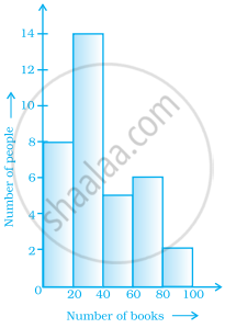
The total number of people surveyed is ______.
Histogram shows the number of people owning the different number of books. Answer the question based on it.

The number of people owning books more than 60 is ______.
