Advertisements
Advertisements
Question
Plot graphs for data given in the Table, using different X and Y scales, on different graph papers. Compare the graphs to find how the appearance of graph is affected by the choice of scales and decide which scale is better and why. Now repeat this with any graph plotting app. Such apps generally automatically adjust the axes to fit the data well on the screen.
| Time | Position |
| 0 s | 0 m |
| 2 s | 1 m |
| 4 s | 4 m |
| 6 s | 9 m |
| 8 s | 16 m |
| 10 s | 25 m |
| 12 s | 36 m |
Advertisements
Solution
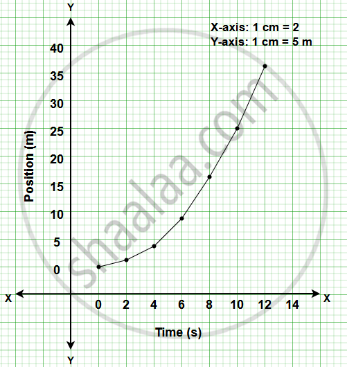
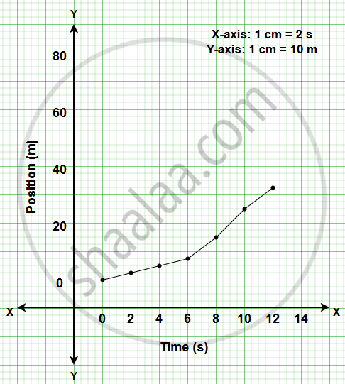
- Both graphs represent the same data.
- In both graphs, the position increases with time, forming an upward-curving graph.
- Changing the scale changes only the appearance of the graph. The relationship between time and position remains the same.
- In Graph 1, the curve is clear and easy to understand.
- In Graph 2, the graph appears flatter because the Y-axis is compressed.
Graph 1 is better because it uses the graph paper efficiently, the plotted points are easy to mark, and the curve is clearer and easier to interpret. Graph 2 also represents the same data correctly, but the compressed Y-axis makes the graph appear flatter.
When the same data is entered into a graph plotting app, the app automatically adjusts the X and Y axes so that the graph fits the screen properly. The graph obtained is the same curved graph, but the app chooses the most suitable scale automatically.
Notes
Students may use any graph plotting app to verify their manually plotted graphs.
