Advertisements
Advertisements
Question
Study the table carefully and answer the following questions:
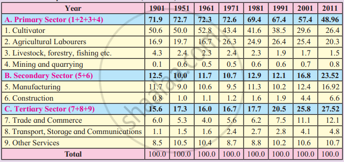
- What does the table show?
- Which sector has the highest occupation? In which year?
- Which sector has the lowest occupation? In which year?
- In which sector is the working population increasing?
- In which sector is the working population occupation decreasing?
- Draw a suitable diagram for statistical information showing A, B and C columns from 1901-2011
- Compare the data. Write a concluding paragraph on the graph.
Diagram
Very Long Answer
Advertisements
Solution
- The table shows the occupational structure of India from 1901 to 2011, indicating the percentage of working population engaged in the Primary, Secondary and Tertiary sectors.
- The Primary Sector has the highest occupation. Its highest share was 72.7% in 1951.
- The Secondary Sector has the lowest occupation. Its lowest share was 10% in 1951.
- The working population is generally increasing in the Secondary and Tertiary sectors.
- The working population is decreasing in the Primary Sector.
- Suitable diagram for A, B and C columns from 1901–2011:
A multiple line graph can be drawn showing the percentage of workers in the Primary, Secondary and Tertiary sectors.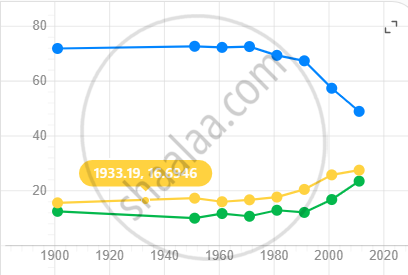
- The graph shows that India’s occupational structure has gradually changed. The share of workers in the Primary Sector has decreased considerably, while the share in the Secondary and Tertiary sectors has increased. This indicates a gradual shift of the Indian economy from agriculture towards industrial and service activities.
shaalaa.com
Is there an error in this question or solution?
