Advertisements
Advertisements
Question
Observe the market supply schedule of potatoes and answer the following question:
| Price in ₹ |
Firms | Market supply (kg) |
||
| A | B | C | ||
| 1 | ____ | 20 | 45 | 100 |
| 2 | 37 | 30 | 45 | ____ |
| 3 | 40 | ____ | 55 | 135 |
| 4 | 44 | 50 | ____ | 154 |
- Complete the quantity of potato supplied by the firms to the market in the above table.
- Draw the market supply curve from the schedule and explain it.
Case Study
Graph
Advertisements
Solution
Price in
₹Firms Market supply
(kg)A B C 1 35 20 45 100 2 37 30 45 112 3 40 40 55 135 4 44 50 60 154 Calculations:
- At ₹ 1: Firm A = 100 − (20 + 45) = 35 kg
- At ₹ 2: Market Supply = 37 + 30 + 45 = 112 kg
- At ₹ 3: Firm B = 135 − (40 + 55) = 40 kg
- At ₹ 4: Firm C = 154 − (44 + 50) = 60 kg
- To draw the market supply curve, plot the following points:
Join the points with a smooth upward-sloping line:Market supply
(kg)Price
(₹)100 1 112 2 135 3 154 4 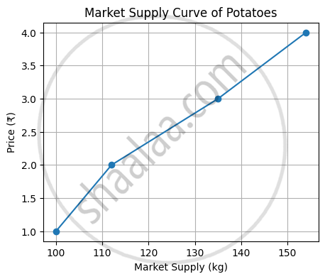
Explanation:
The market supply curve slopes upward from left to right. It shows a direct relationship between price and quantity supplied. As the price of potatoes increases, producers are willing to supply a greater quantity to the market.
shaalaa.com
Is there an error in this question or solution?
