Advertisements
Advertisements
Question
Draw a market equilibrium graph using the following demand schedule.
| Price (₹) | 10 | 20 | 30 | 40 | 50 |
| Q.D. (kg) | 5 | 10 | 15 | 20 | 25 |
| Q.S. (kg) | 25 | 20 | 15 | 10 | 5 |
- Plot the demand and supply curve using the above data.
- Identify the equilibrium price and quantity.
- Observe the above data and analyse what happens if the price is set at ₹20 or ₹40.
Graph
Short Answer
Advertisements
Solution
- The demand curve slopes upward, and the supply curve slopes downward using the given data.
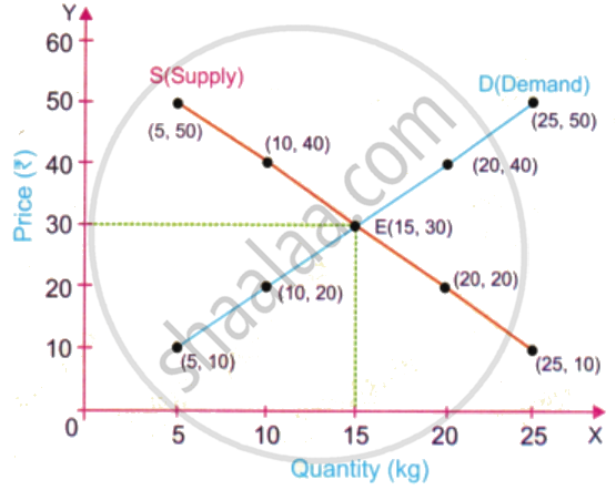
- Equilibrium Price = ₹ 30
Equilibrium Quantity = 15 kg - At ₹20, there is excess supply. At ₹40, there is excess demand. The market moves towards the equilibrium price of ₹30. Equilibrium price = ₹30, where demand equals supply.
shaalaa.com
Is there an error in this question or solution?
