Advertisements
Advertisements
प्रश्न
The production of saleable steel in some of the steel plants our country during 1999 is given below:
| Plant | Bhilai | Durgapur | Rourkela | Bokaro |
| Production (In thousand tonnes) |
160 | 80 | 200 | 150 |
Construct a bar graph to represent the above data on a graph paper by using the scale 1 big divisions = 20 thousand tonnes.
Advertisements
उत्तर
To represent the given data by a vertical bar graph, we first draw horizontal and vertical axes. Let us consider that the horizontal and vertical axes represent the plants and the production in thousand tonnes respectively. We have to draw 4 bars of different lengths given in the table.
The scale 1 big divisions must be 20 thousand tonnes. So, first find the heights of the bars corresponding to different plants. After that, we follow the well known procedure.
The heights of the different bars are:
1. The height of the bar corresponding to Bhilai is `160/20=8` big division.
2. The height of the bar corresponding to Durgapur is `80/20=4` big divisions.
3. The height of the bar corresponding to Rourkela is `200/20=10` big divisions.
4. The height of the bar corresponding to Bokaro is `150/20=7.5 ` big divisions.
At first we mark 4 points in the horizontal axis at equal distances and erect rectangles of the same width at these points. The heights of the rectangles are proportional to the productions.
The vertical bar graph of the given data is following:
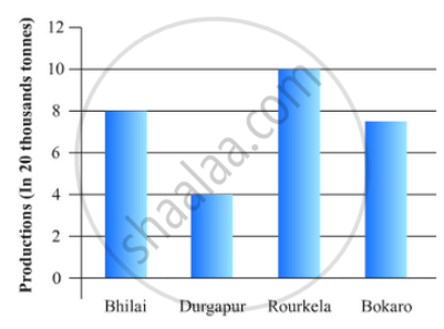
Note that the one big division in the vertical axis is equivalent to 20 thousand tonnes.
APPEARS IN
संबंधित प्रश्न
Given below are the seats won by different political parties in the polling outcome of a state assembly elections:-
| Political Party | A | B | C | D | E | F |
| Seats Won | 75 | 55 | 37 | 29 | 10 | 37 |
- Draw a bar graph to represent the polling results.
- Which political party won the maximum number of seats?
The length of 40 leaves of a plant are measured correct to one millimetre, and the obtained data is represented in the following table:-
| Length (in mm) | Number of leaves |
| 118 - 126 | 3 |
| 127 - 135 | 5 |
| 136 - 144 | 9 |
| 145 - 153 | 12 |
| 154 - 162 | 5 |
| 163 - 171 | 4 |
| 172 - 180 | 2 |
- Draw a histogram to represent the given data. [Hint: First make the class intervals continuous]
- Is there any other suitable graphical representation for the same data?
- Is it correct to conclude that the maximum number of leaves are 153 mm long? Why?
The following table gives the distribution of students of two sections according to the mark obtained by them:-
| Section A | Section B | ||
| Marks | Frequency | Marks | Frequency |
| 0 - 10 | 3 | 0 - 10 | 5 |
| 10 - 20 | 9 | 10 - 20 | 19 |
| 20 - 30 | 17 | 20 - 30 | 15 |
| 30 - 40 | 12 | 30 - 40 | 10 |
| 40 - 50 | 9 | 40 - 50 | 1 |
Represent the marks of the students of both the sections on the same graph by two frequency polygons. From the two polygons compare the performance of the two sections.
Explain the reading and interpretation of bar graphs.
The following data gives the amount of loans (in crores of rupees) disbursed by a bank during some years:
| Year | 1992 | 1993 | 1994 | 1995 | 1996 |
| Loan (in crores of rupees) |
28 | 33 | 55 | 55 | 80 |
(i) Represent the above data with the help of a bar graph.
(ii) With the help of the bar graph, indicate the year in which amount of loan is not increased over that of the preceding year.
The investment (in ten crores of rupees) of Life Insurance Corporation of India in different sectors are given below:
| Sectors | Investment (in ten crores of rupees) |
| Central Government Securities State Government Securities Securities guaranteed by the Government Private Sectors Socially oriented sectors (Plans) Socially oriented sectors (Non-Plan) |
45 11 23 18 46 11 |
Represent the above data with the help of bar graph.
The expenditure (in 10 crores of rupees) on health by the Government of India during the various five year plans is shown below:
| Plans: | I | II | III | IV | V | VI |
| Expenditure on health (in 10 crores of rupees) |
7 | 14 | 23 | 34 | 76 | 182 |
Construct a bar graph to represent the above data.
A histogram is a pictorial representation of the grouped data in which class intervals and frequency are respectively taken along
Construct a frequency polygon for the following data:
| Class-Intervals | 10-14 | 15-19 | 20-24 | 25-29 | 30-34 |
| Frequency | 5 | 8 | 12 | 9 | 4 |
Following table gives the distribution of students of sections A and B of a class according to the marks obtained by them.
| Section A | Section B | ||
| Marks | Frequency | Marks | Frequency |
| 0 – 15 | 5 | 0 – 15 | 3 |
| 15 – 30 | 12 | 15 – 30 | 16 |
| 30 – 45 | 28 | 30 – 45 | 25 |
| 45 – 60 | 30 | 45 – 60 | 27 |
| 60 –75 | 35 | 60 – 75 | 40 |
| 75 – 90 | 13 | 75 – 90 | 10 |
Represent the marks of the students of both the sections on the same graph by two frequency polygons. What do you observe?
