Advertisements
Advertisements
प्रश्न
The monthly profits (in Rs.) of 100 shops are distributed as follows:
| Profits per shop: | 0-50 | 50-100 | 100-50 | 150-200 | 200-250 | 250-300 |
| No. shops: | 12 | 18 | 27 | 20 | 17 | 6 |
Draw a histogram for the data and show the frequency polygon for it.
Advertisements
उत्तर
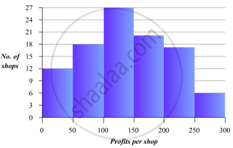
To represent the given data by a histogram, we first draw horizontal and vertical axes. Let us consider that the horizontal and vertical axes represent the class-intyervals and the frequencies of the class-intervals respectively.
The given data is a continuous grouped frequency distribution with equal class-intervals. Construct rectangles with class-intervals as bases and respective frequencies as heights. The scale for horizontal axis may not be same as the scale for vertical axis. Let us take one vertical division is equal to 3 shops.
The heights of the different rectangles are as following
1. The height of the rectangle corresponding to the class-interval 0-50 is ` 12/3 = 4` big divisions.
2. The height of the rectangle corresponding to the class-interval 50-100 is `18/3 = 6` big divisions.
3. The height of the rectangle corresponding to the class-interval 100-150 is `27/3 = 9` big divisions.
4. The height of the rectangle corresponding to the class-interval 150-200 is ` 20/3 = 6.67` big divisions.
5. The height of the rectangle corresponding to the class-interval 200-250 is `17/3 = 5.67` big divisions.
6. The height of the rectangle corresponding to the class-interval 250-300 is `6/3 =2` big divisions.
The histogram of the given data is as follows:
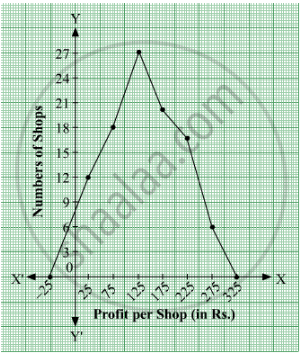
 For frquency polygon, first we will obtain the class marks as given in the following table.
| Profits per shop | Class Marks | Number of shops |
| 0-50 | 25 | 12 |
| 50-100 | 75 | 18 |
| 100-150 | 125 | 27 |
| 150-200 | 175 | 20 |
| 200-250 | 225 | 17 |
| 250-300 | 275 | 6 |
We plot the points (25, 12), (75, 18), (125, 27), (175, 20), (225, 17) and (275, 6).
Now, we join the plotted points by line segments . The end points (25, 12) and (275, 6) are joined to the mid-points (−25, 0) and (325, 0) respectively of imagined class-intervals to obtain the frequency polygon.
The frequency polygon of the given data is as follows:
APPEARS IN
संबंधित प्रश्न
The following table gives the life times of 400 neon lamps:-
| Life time (in hours) | Number of lamps |
| 300 - 400 | 14 |
| 400 - 500 | 56 |
| 500 - 600 | 60 |
| 600 - 700 | 86 |
| 700 - 800 | 74 |
| 800 - 900 | 62 |
| 900 - 1000 | 48 |
- Represent the given information with the help of a histogram.
- How many lamps have a life time of more than 700 hours?
The following bar graph (Fig. 23. 1 4) represents the heights (in cm) of 50 students of Class XI of a particular school. Study the graph and answer the following questions:

(i) What percentage of the total number of students have their heights more than 149cm?
(ii) How many students in the class are in the range of maximum height of the class?
(iii) The school wants to provide a particular type of tonic to each student below the height
of 150 cm to improve his height. If the cost of the tonic for each student comes out to be Rs. 55, how much amount of money is required?
(iv) How many students are in the range of shortest height of the class?
(v) State whether true or false:
a. There are 9 students in the class whose heights are in the range of 155 - 159 cm.
b. Maximum height (in cm) of a student in the class is 17.
c. There are 29 students in the class whose heights are in the range of 145- 154 cm.
d. Minimum height (in cm) of a student is the class is in the range of 140 – 144 cms.
e. The number of students in the class having their heights less than 150 cm is 12.
f. There are 14 students each of whom has height more than 154. cm.
The following bar graph shows the results of an annual examination in a secondary school. Read the bar graph and choose the correct alternative in each of the following:

(i) The pair of classes in which the results of boys and girls are inversely proportional are:
(a) VI, VIII (b) VI, IX (c) VIII, IX (d) VIII, X
(ii) The class having the lowest failure rate of girls is
(a) VII (b) X (c) IX (d) VIII
(iii)The class having the lowest pass rate of students is
(a) VI (b) VII (c) VIII (d) IX
The following tables gives the quantity of goods (in crore tonnes)
| Year | 1950-51 | 1960-61 | 1965-66 | 1970-71 | 1980-81 | 1982-83 |
| Quantity of Goods (in crore tonnes) |
9 | 16 | 20 | 20 | 22 | 26 |
Explain through the bar graph if the quantity of goods carried by the Indian Railways in 1965-66 is more than double the quantity of goods carried in the year 1950-51.
Draw, in the same diagram, a histogram and a frequency polygon to represent the following data which shows the monthly cost of living index of a city in a period of 2 years:
| Cost of living index: |
440-460 | 460-480 | 480-500 | 500-520 | 520-540 | 540-560 | 560-580 | 580-600 |
| No. of months: | 2 | 4 | 3 | 5 | 3 | 2 | 1 | 4 |
In a frequency distribution, ogives are graphical representation of
A histogram is a pictorial representation of the grouped data in which class intervals and frequency are respectively taken along
Students of a small school use different modes of travel to school as shown below:
| Mode | Bus | Car | Bicycle | Auto | On foot |
| No. of students | 142 | 98 | 50 | 34 | 16 |
Draw a suitable bar graph.
The frequency distribution has been represented graphically as follows:
| Marks | 0 – 20 | 20 – 40 | 40 – 60 | 60 – 100 |
| Number of Students | 10 | 15 | 20 | 25 |

Do you think this representation is correct? Why?
Expenditure on Education of a country during a five year period (2002-2006), in crores of rupees, is given below:
| Elementary education | 240 |
| Secondary Education | 120 |
| University Education | 190 |
| Teacher’s Training | 20 |
| Social Education | 10 |
| Other Educational Programmes | 115 |
| Cultural programmes | 25 |
| Technical Education | 125 |
Represent the information above by a bar graph.
