Advertisements
Advertisements
Question
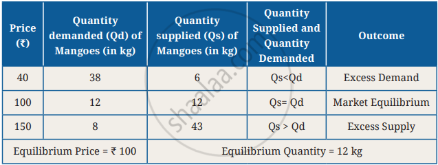
Using data from the table, plot the demand and supply curves at the three prices, i.e., ₹40, ₹100, and ₹150. Identify and mark excess demand and supply on the graph. Think about how equilibrium could be reached in these scenarios.
Graph
Advertisements
Solution
At ₹ 40, quantity demanded is greater than quantity supplied, resulting in excess demand.
At ₹ 150, quantity supplied is greater than quantity demanded, resulting in excess supply.
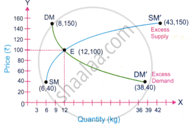
- Equilibrium will be reached somewhere in between. Let’s plot supply as well.
- At ₹ 100, quantity demanded equals quantity supplied, and the market is in equilibrium.
- Equilibrium is reached as prices adjust according to changes in demand and supply.
shaalaa.com
Is there an error in this question or solution?
