Advertisements
Advertisements
Question
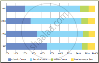
The graph in fig 6.3 shows trade carried from 1980 to 2010 through sea transport. Interpret the graph in your own words.
Very Long Answer
Advertisements
Solution
The graph shows the percentage share of sea trade carried through different oceans and the Mediterranean Sea from 1980 to 2010.
- The Pacific Ocean has the largest share of sea trade in all the years shown.
- The share of trade through the Atlantic Ocean gradually decreased, from about 35% in 1980 to around 20% in 2010.
- Trade through the Pacific Ocean increased in importance and remained the dominant route.
- The Indian Ocean carried a comparatively smaller but noticeable share of world sea trade.
- The Mediterranean Sea accounted for the smallest share.
- By 2010, the concentration of sea trade had shifted more towards the Pacific and Indian Ocean regions.
The graph indicates that world sea trade became increasingly concentrated in the Pacific region, while the relative importance of the Atlantic Ocean declined over the period.
shaalaa.com
Is there an error in this question or solution?
