Advertisements
Advertisements
Question
Draw a suitable graph for the following information given in table and write a paragraph interpreting the data.
Contribution of various sectors in the national income. (%)
| Countries | Primary 2018 | Secondary 2018 | Tertiary 2018 |
| Denmark | 1.0 | 34.0 | 65.0 |
| India | 14.0 | 30.0 | 56.0 |
| Kenya | 34.0 | 23.3 | 42.7 |
| New Zealand | 7.0 | 27.4 | 65.6 |
| Russia Federation | 3.0 | 43.0 | 54.0 |
| Tajikistan | 21.0 | 37.2 | 41.8 |
| Tanzania | 29.0 | 33.1 | 37.9 |
| Uganda | 24.0 | 28.4 | 47.6 |
| United Kingdom | 1.0 | 28.5 | 70.5 |
| U.S.A | 1.0 | 21.6 | 77.4 |
Advertisements
Solution
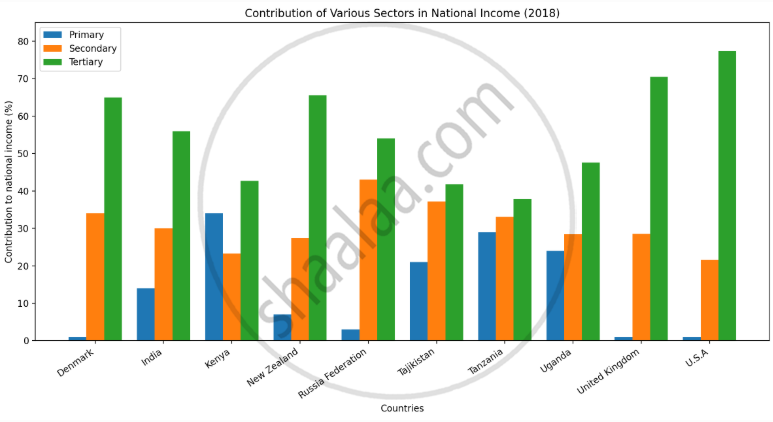
A multiple bar graph is suitable for this data because it allows comparison of the contribution of the Primary, Secondary and Tertiary sectors in different countries.
The graph shows that the tertiary sector contributes the highest share of national income in most countries. Its contribution is highest in the U.S.A. at 77.4%, followed by the United Kingdom at 70.5%. Developed countries such as Denmark, New Zealand, the U.K. and U.S.A. have a very small contribution from the primary sector and a large contribution from services.
In countries such as Kenya, Tanzania and Uganda, the primary sector has a comparatively higher share. India also shows a higher contribution from the tertiary sector than from the primary and secondary sectors.
As an economy develops, the contribution of the primary sector generally decreases, while the secondary and especially tertiary sectors become more important.
