Advertisements
Advertisements
प्रश्न
The graph shows the maximum temperatures recorded for two consecutive weeks of a town. Study the graph and answer the questions that follow.

- What information is given by the two axes?
- In which week was the temperature higher on most of the days?
- On which day was the temperature same in both the weeks?
- On which day was the difference in temperatures the maximum for both the weeks?
- What were the temperatures for both the weeks on Thursday?
- On which day was the temperature 35°C for the first week?
- On which day was the temperature highest for the second week?
Advertisements
उत्तर
- The X-axis represents days of a particular week and the X-axis represents the maximum temperature (in °C) recorded.
- Observing the graph, we see that in the first-week temperature was higher on most of the days.
- The temperature was same on Wednesday in both the weeks.
- The difference in temperatures was the maximum on Friday for both the weeks.
- The temperature for the first week on Thursday was 37°C and the temperature for the second week on the same day was 34°C.
- On Sunday, the temperature was 35° for the first week.
- On Wednesday, the temperature was highest for the second week.
APPEARS IN
संबंधित प्रश्न
The following table shows the number of Buses and Trucks in nearest lakh units. Draw percentage bar-diagram. (Approximate the percentages to the nearest integer)
| Year | No of trucks | No of buses |
| 2005-2006 2007-2008 2008-2009 2009-2010 |
47 56 60 63 |
9 13 16 18 |
Try yourself
On any one day, choose any three cities and record their temperature from the TV or newspaper.
- Make a bar chart in your notebook and ask your friends a few questions about it. See if they understand your chart!
Comparison of parts of a whole may be done by a ______.
The graph given below shows the marks obtained out of 10 by Sonia in two different tests. Study the graph and answer the questions that follow.

- What information is represented by the axes?
- In which subject did she score the highest in Test I?
- In which subject did she score the least in Test II?
- In which subject did she score the same marks in both the Tests?
- What are the marks scored by her in English in Test II?
- In which test was the performance better?
- In which subject and which test did she score full marks?
To represent the population of different towns using bar graph, it is convenient to take one unit length to represent one person.
The following graph gives the information about the number of railway tickets sold for different cities on a railway ticket counter between 6.00 am to 10.00 am.
Read the bar graph and answer the following questions.
Scale: 1 unit length = 10 tickets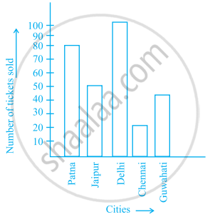
- How many tickets were sold in all?
- For which city were the maximum number of tickets sold?
- For which city were the minimum number of tickets sold?
- Name the cities for which the number of tickets sold is more than 20
- Fill in the blanks:
Number of tickets sold for Delhi and Jaipur together exceeds the total number of tickets sold for Patna and Chennai by ______.
Read the bar graph given below and answer the following questions:
Scale: 1 unit = 50 students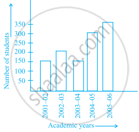
- What information is given by the bar graph?
- In which year is the number of students maximum?
- In which year is the number of students twice as that of 2001 – 02?
- In which year did the number of students decrease as compared to previous year?
- In which year is the increase in number of students maximum as compared to the previous year?
Prepare a bar graph of the data given in the question.
| Surname | Number of people |
| Khan |  |
| Patel |  |
| Rao |  |
| Roy |  |
| Saikia |  |
| Singh |  |
The bar graph given below shows the marks of students of a class in a particular subject:

Study the bar graph and answer the following questions:
- If 40 is the pass mark, then how many students have failed?
- How many students got marks from 50 to 69?
- How many students scored 90 marks and above?
- If students who scored marks above 80 are given merits then how many merit holders are there?
- What is the strength of the class?
Study the bar graph given below and answer the questions that follow.
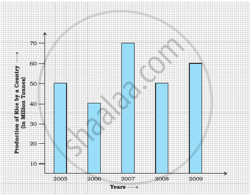
- What information does the above bar graph represent?
- In which year was production the least?
- After which year was the maximum rise in the production?
- Find the average production of rice during the 5 years.
- Find difference of rice production between years 2006 and 2008.
