Advertisements
Advertisements
प्रश्न
Draw the temperature-time graph in each of the following cases:
| Time (in hours): | 7:00 | 9:00 | 11:00 | 13:00 | 15:00 | 17:00 | 19:00 | 21:00 |
| Temperature (°F) in: | 100 | 101 | 104 | 102 | 100 | 99 | 100 | 98 |
Advertisements
उत्तर
Here, time is an independent variable and temperature is a dependent variable. So, we take time on the x-axis and temperature on the y-axis.
Let us choose the following scale:
For point (ii):
On x-axis: 2 cm = 2 hours
On y-axis: 1 cm = 1οF
Let us assume that on the x-axis, the coordinate of origin is 6:00.
On y-axis, the coordinate of origin is 94οF .
So, the coordinates of O are (6:00, 94).
Now, let us plot (7:00, 100), (9:00, 101), (11:00, 104),..(21:00, 98) for point (i) and (8:00, 100), (10:00, 101), (12:00, 104),...,(20:00, 100) for point (ii). These points are joined to get the graphs representing the given information as shown in the figures below.

संबंधित प्रश्न
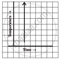
Can there be a time-temperature graph as follows? Justify your answer.
The following table shows the number of patients discharged from a hospital with HIV diagnosis in different years:
| Years: | 2002 | 2003 | 2004 | 2005 | 2006 |
| Number of patients: | 150 | 170 | 195 | 225 | 230 |
Represent this information by a graph.
Draw the temperature-time graph in each of the following cases:
| Time (in hours): | 8:00 | 10:00 | 12:00 | 14:00 | 16:00 | 18:00 | 20:00 |
| Temperature (°F) in: | 100 | 101 | 104 | 103 | 99 | 98 | 100 |
Draw the velocity-time graph from the following data:
| Time (in hours): | 7:00 | 8:00 | 9:00 | 10:00 | 11:00 | 12:00 | 13:00 | 14:00 |
| Speed (in km/hr): | 30 | 45 | 60 | 50 | 70 | 50 | 40 | 45 |
Find out from the growth chart
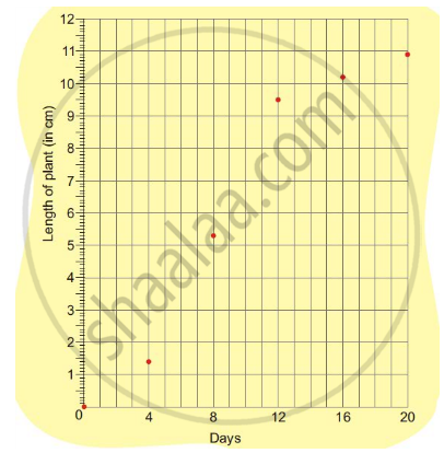
- What could be the length of this plant on the 14th day? Guess.
A graph that displays data that changes continuously over periods of time is ______.
Study the given graph and complete the corresponding table below.

Study the graph and answer the questions that follow.
- What information does the graph give?
- On which day was the temperature the least?
- On which day was the temperature 31°C?
- Which was the hottest day?

The following graph shows the change in temperature of a block of ice when heated. Use the graph to answer the following questions:
- For how many seconds did the ice block have no change in temperature?
- For how long was there a change in temperature?
- After how many seconds of heating did the temperature become constant at 0°C?
- What was the temperature after 25 seconds?
- What will be the temperature after 1.5 minutes? Justify your answer.

The following graph shows the number of people present at a certain shop at different times. Observe the graph and answer the following questions.

- What type of a graph is this?
- What information does the graph give?
- What is the busiest time of day at the shop?
- How many people enter the shop when it opens?
- About how many people are there in the shop at 1:30 pm?
