Advertisements
Chapters
2: Data Handling using Pandas - I
3: Data Handling using Pandas - II
▶ 4: Plotting Data using Matplotlib
5: Internet and Web
6: Societal Impacts
Chapter 7: Project Based Learning
![NCERT solutions for इन्फॉर्मैटिक्स प्रैक्टिसिज़ [अंग्रेजी] कक्षा १२ chapter 4 - Plotting Data using Matplotlib - Shaalaa.com](/images/informatics-practices-english-class-12_6:55813b5fe8c1458f80d0fbe8dfc569b6.jpg "NCERT solutions for इन्फॉर्मैटिक्स प्रैक्टिसिज़ [अंग्रेजी] कक्षा १२ chapter 4 - Plotting Data using Matplotlib")
Advertisements
Solutions for Chapter 4: Plotting Data using Matplotlib
Below listed, you can find solutions for Chapter 4 of CBSE NCERT for इन्फॉर्मैटिक्स प्रैक्टिसिज़ [अंग्रेजी] कक्षा १२.
NCERT solutions for इन्फॉर्मैटिक्स प्रैक्टिसिज़ [अंग्रेजी] कक्षा १२ 4 Plotting Data using Matplotlib Intext Questions [Pages 109 - 132]
Think and Reflect
On providing a single list or array to the plot() function, can matplotlib generate values for both the x and y axiz?
Activity 4.1
Create the MelaSale. csv using Python Pandas containing data as shown in the table.
| Week 1 | Week 2 | Week 3 |
| 5000 | 4000 | 4000 |
| 5900 | 3000 | 5800 |
| 6500 | 5000 | 3500 |
| 3500 | 5500 | 2500 |
| 4000 | 3000 | 3000 |
| 5300 | 4300 | 5300 |
| 7900 | 5900 | 6000 |
Think and Reflect
How can we make the bar chart of the figure horizontal?
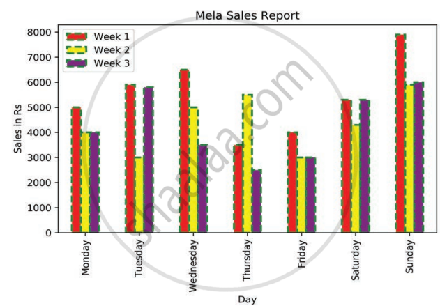
Activity 4.2
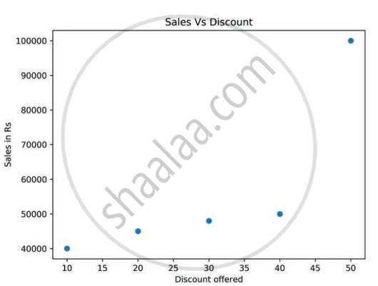
What value does each bubble on the plot in the figure represent?
Think and Reflect
What would happen if we use df.plot(kind=’scatter’) instead of plt.scatter() in the program?
import numpy as np
import matplotlib.pyplot as plt
discount= np.array([10,20,30,40,50])
saleInRs=np.array([40000,45000,48000,50000,100000])
size=discount*10
plt.scatter(x=discount,y=saleInRs,s=size,color='red',linewidth=3,m
arker='*',edgecolor='blue'
plt.title('Sales Vs Discount')
plt.xlabel('Discount offered')
plt.ylabel('Sales in Rs')
plt.show()Think and Reflect
What would happen if the label or row index passed is not present in the DataFrame?
Think and Reflect
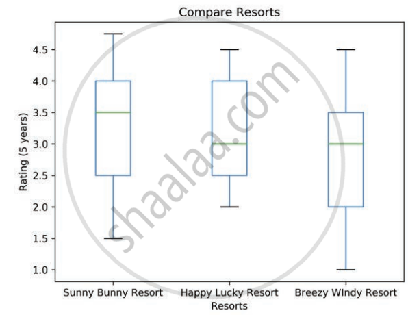
Which of the three resorts should be awarded? Give reasons.
Think and Reflec
What effect did ‘legend=False’ in the program have on the output?
import pandas as pd
import matplotlib.pyplot as plt
df=pd.DataFrame({'GeoArea':[83743,78438,22327,22429,21081,16579,10486]
     ,'ForestCover':[67353,27692,17280,17321,19240,13464,8073]},
      index=['Arunachal Pradesh','Assam','Manipur','Meghalaya'
    ,'Mizoram','Nagaland','Tripura'])
df.plot(kind='pie',y='ForestCover',title='Forest cover of North Eastern
states',legend=False)
plt.show()NCERT solutions for इन्फॉर्मैटिक्स प्रैक्टिसिज़ [अंग्रेजी] कक्षा १२ 4 Plotting Data using Matplotlib Exercise [Pages 134 - 1356]
What is the purpose of the Matplotlib library?
What are some of the major components of any graphs or plot?
Name the function which is used to save the plot.
Write short notes on different customisation options available with any plot.
What is the purpose of a legend?
Define Pandas visualisation.
What is open data?
Name any two websites from which we can download open data.
Give an example of data comparison where we can use the scatter plot.
Name the plot which displays the statistical summary.
Note: Give appropriate title, set xlabel and ylabel while attempting the following questions.
Plot the following data using a line plot:
| Day | 1 | 2 | 3 | 4 | 5 | 6 | 7 |
| Tickets sold | 2000 | 2800 | 3000 | 2500 | 2300 | 2500 | 1000 |
- Before displaying the plot display “Monday, Tuesday, Wednesday, Thursday, Friday, Saturday, Sunday” in place of Day 1, 2, 3, 4, 5, 6, 7
- Change the color of the line to ‘Magenta’.
Collect data about colleges in Delhi University or any other university of your choice and number of courses they run for Science, Commerce and Humanities, store it in a CSV file and present it using a bar plot.
Collect and store data related to the screen time of students in your class separately for boys and girls and present it using a boxplot.
Explain the findings of the boxplot of Figure by filling in the following blanks:
- The median for the five subjects is ______, ______, ______, ______, ______
- The highest value for the five subjects is ______, ______, ______, ______, ______
- The lowest value for the five subjects is ______, ______, ______, ______, ______
- ______ subject has two outliers with the value ______ and ______
- ______ subject shows minimum variation
Collect the minimum and maximum temperature of your city for a month and present it using a histogram plot.
Conduct a class census by preparing a questionnaire. The questionnaire should contain a minimum of five questions. Questions should relate to students, their family members, their class performance, their health etc. Each student is required to fill up the questionnaire. Compile the information in numerical terms (in terms of percentage). Present the information through a bar, scatter–diagram. (NCERT Geography class IX, Page 60).
Visit data.gov.in, search for the following in “catalogs” option of the website:
- Final population Totals, India and states
- State-wise literacy rate
Download them and create a CSV file containing population data and literacy rate of the respective state. Also add a column Region to the CSV file that should contain the values East, West, North and South. Plot a scatter plot for each region where X axis should be population and Y axis should be Literacy rate. Change the marker to a diamond and size as the square root of the literacy rate.
Group the data on the column region and display a bar chart depicting average literacy rate for each region.
Solutions for 4: Plotting Data using Matplotlib
NCERT solutions for इन्फॉर्मैटिक्स प्रैक्टिसिज़ [अंग्रेजी] कक्षा १२ chapter 4 - Plotting Data using Matplotlib
Shaalaa.com has the CBSE Mathematics इन्फॉर्मैटिक्स प्रैक्टिसिज़ [अंग्रेजी] कक्षा १२ CBSE solutions in a manner that help students grasp basic concepts better and faster. The detailed, step-by-step solutions will help you understand the concepts better and clarify any confusion. NCERT solutions for Mathematics इन्फॉर्मैटिक्स प्रैक्टिसिज़ [अंग्रेजी] कक्षा १२ CBSE 4 (Plotting Data using Matplotlib) include all questions with answers and detailed explanations. This will clear students' doubts about questions and improve their application skills while preparing for board exams.
Further, we at Shaalaa.com provide such solutions so students can prepare for written exams. NCERT textbook solutions can be a core help for self-study and provide excellent self-help guidance for students.
Concepts covered in इन्फॉर्मैटिक्स प्रैक्टिसिज़ [अंग्रेजी] कक्षा १२ chapter 4 Plotting Data using Matplotlib are Introduction of Plotting Data Using Matplotlib, Plotting Using Matplotlib, Customisation of Plots, The Pandas Plot Function (Pandas Visualisation).
Using NCERT इन्फॉर्मैटिक्स प्रैक्टिसिज़ [अंग्रेजी] कक्षा १२ solutions Plotting Data using Matplotlib exercise by students is an easy way to prepare for the exams, as they involve solutions arranged chapter-wise and also page-wise. The questions involved in NCERT Solutions are essential questions that can be asked in the final exam. Maximum CBSE इन्फॉर्मैटिक्स प्रैक्टिसिज़ [अंग्रेजी] कक्षा १२ students prefer NCERT Textbook Solutions to score more in exams.
Get the free view of Chapter 4, Plotting Data using Matplotlib इन्फॉर्मैटिक्स प्रैक्टिसिज़ [अंग्रेजी] कक्षा १२ additional questions for Mathematics इन्फॉर्मैटिक्स प्रैक्टिसिज़ [अंग्रेजी] कक्षा १२ CBSE, and you can use Shaalaa.com to keep it handy for your exam preparation.
