Advertisements
Advertisements
प्रश्न
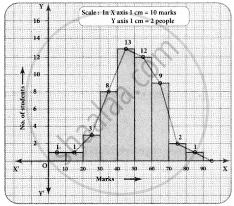
The marks obtained by 50 students in Mathematics are given below.
(i) Make a frequency distribution table taking a class size of 10 marks
(ii) Draw a histogram and a frequency polygon.
| 52 | 33 | 56 | 52 | 44 | 59 | 47 | 61 | 49 | 61 |
| 47 | 52 | 67 | 39 | 89 | 57 | 64 | 58 | 63 | 65 |
| 32 | 64 | 50 | 54 | 42 | 48 | 22 | 37 | 59 | 63 |
| 36 | 35 | 48 | 48 | 55 | 62 | 74 | 43 | 41 | 51 |
| 08 | 71 | 30 | 18 | 43 | 28 | 20 | 40 | 58 | 49 |
Advertisements
उत्तर
Maximum marks obtained = 89
Minimum marks obtained = 08
Range = Maximum marks – Minimim marks
= 89 – 08
= 81
Taking the class size = 10, then
Number of possible intervals = `"Range"/"Class size"`
= `81/10`
= 8.1
= 9
| Class Interval | Tally marks | Frequency |
| 0 − 10 | I | 1 |
| 10 − 20 | I | 1 |
| 20 − 30 | III | 3 |
| 30 − 40 | IIII III | 8 |
| 40 − 50 | IIII IIII III | 13 |
| 50 − 60 | IIII IIII II | 12 |
| 60 − 70 | IIII IIII | 9 |
| 70 − 80 | II | 2 |
| 80 − 90 | I | 1 |
| Total | 50 | 50 |
Now we have the continuous frequency table.
| Class Intervals | 0 − 10 | 10 − 20 | 20 − 30 | 30 − 40 | 40 − 50 | 50 − 60 | 60 − 70 | 70 − 80 | 80 − 90 |
| Frequency | 1 | 1 | 3 | 8 | 13 | 12 | 9 | 2 | 1 |
We will draw the histogram taking class interval in x-axis and frequency in y-axis as follows.
APPEARS IN
संबंधित प्रश्न
Construct histograms for following frequency distribution:
| Class Interval | 110-119 | 120-129 | 130-139 | 140-149 | 150-159 |
| Frequency | 15 | 23 | 30 | 20 | 16 |
Represent the following data by histogram:
| Price of sugar Per kg (in Rs) | Number of weeks |
| 28-30 | 4 |
| 30-32 | 8 |
| 32-34 | 22 |
| 34-36 | 12 |
| 36-38 | 6 |
Identify the following data can be represented in a histogram?
The wickets fallen from 1 over to 50th over in a one day cricket match
In a village, there are 570 people who have cell phones. An NGO survey their cell phone usage. Based on this survey a histogram is drawn
How many people use the cell phone for less than 3 hours?
Histogram is a graph of a ________ frequency distribution
The height of a rectangle in a histogram shows the ______.
The top speeds of thirty different land animals have been organised into a frequency table. Draw a histogram for the given data.
| Maximum Speed (km/h) | Frequency |
| 10 – 20 | 5 |
| 20 – 30 | 5 |
| 30 – 40 | 10 |
| 40 – 50 | 8 |
| 50 – 60 | 0 |
| 60 – 70 | 2 |
Draw a histogram for the following data.
| Class interval | 10 – 15 | 15 – 20 | 20 – 25 | 25 – 30 | 30 – 35 | 35 – 40 |
| Frequency | 30 | 98 | 80 | 58 | 29 | 50 |
What is a histogram?
For what type of data is a histogram used?
