Advertisements
Advertisements
प्रश्न
Observe the given bar graph carefully and answer the questions that follow.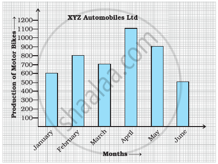
- What information does the bar graph depict?
- How many motor bikes were produced in the first three months?
- Calculate the increase in production in May over the production in January.
- In which month the production was minimum and what was it?
- Calculate the average (mean) production of bikes in 6 months.
Advertisements
उत्तर
a. The given bar graph shows the production of motorbikes by XYZ automobiles Ltd from January to June.
b. Total number of motorbikes produced in first three months = Motor bikes produced in January + Motorbikes produced in February + Motorbikes produced in March
= 600 + 800 + 700
= 2100
c. Increase in production in May over the production in January
= Production in May – Production in January
= 900 – 600
= 300
d. By observing the graph, we can say that the production was minimum in the month of June, i.e. 500.
e. Average production = `"Total production"/"Number of months"`
= `(600 + 800 + 700 + 1100 + 900 + 500)/6`
= `4600/6`
= 767 bikes ...(approx)
APPEARS IN
संबंधित प्रश्न
Read the bar graph (see the given figure) which shows the number of books sold by a bookstore during five consecutive years and answer the questions that follow:

- About how many books were sold in 1989? 1990? 1992?
- In which year were about 475 books sold? About 225 books sold?
- In which years were fewer than 250 books sold?
- Can you explain how you would estimate the number of books sold in 1989?
The following table shows the number of Buses and Trucks in nearest lakh units. Draw percentage bar-diagram. (Approximate the percentages to the nearest integer)
| Year | No of trucks | No of buses |
| 2005-2006 2007-2008 2008-2009 2009-2010 |
47 56 60 63 |
9 13 16 18 |
The following table shows the number of Buses and Trucks in nearest lakh units. Draw percentage bar-diagram. (Approximate the percentages to the nearest integer)
| Year | No. of Trucks | No. of Buses |
| 2006-2007 | 47 | 9 |
| 2007-2008 | 56 | 13 |
| 2008-2009 | 60 | 16 |
| 2009-2010 | 63 | 18 |
Practice time: Afterschool
Ask 10 of your friends about what they like to do most after school.
| What they like to do after school |
Number of children |
| Watching TV | |
| Playing football | |
| Reading storybooks | |
In a bar graph, the width of bars may be unequal.
The following bar graph represents the data for different sizes of shoes worn by the students in a school.
Read the graph and answer the following questions.
Scale: 1 unit length = 50 students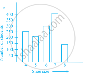
- Find the number of students whose shoe sizes have been collected.
- What is the number of students wearing shoe size 6?
- What are the different sizes of the shoes worn by the students?
- Which shoe size is worn by the maximum number of students?
- Which shoe size is worn by minimum number of students?
- State whether true or false:
The total number of students wearing shoe sizes 5 and 8 is the same as the number of students wearing shoe size 6.
The bar graph given below represents approximate length (in kilometres) of some National Highways in India.
Study the bar graph and answer the following questions:
Scale: 1 unit length = 200 km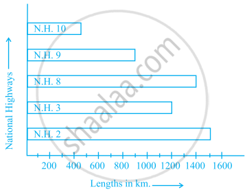
- Which National Highway (N.H.) is the longest among the above?
- Which National Highway is the shortest among the above?
- What is the length of National Highway 9?
- Length of which National Highway is about three times the National Highway 10?
The lengths in km (rounded to nearest hundred) of some major rivers of India is given below:
| River | Length (in km) |
| Narmada | 1300 |
| Mahanadi | 900 |
| Brahmputra | 2900 |
| Ganga | 2500 |
| Kaveri | 800 |
| Krishna | 1300 |
Draw a bar graph to represent the above information.
| Crop | Area of land (in million hectares) |
| Rice | 50 |
| Wheat | 30 |
| Pulses | 20 |
| Sugarcane | 25 |
| Cotton | 15 |
Prepare a bar graph of the data.
Observe the given data:
| Days of the week |
Mon | Tues | Wed | Thurs | Fri | Sat |
| Number of Mobile Phone Sets Sold |
50 | 45 | 30 | 55 | 27 | 60 |
- Draw a bar graph to represent the above given information.
- On which day of the week was the sales maximum?
- Find the total sales during the week.
- Find the ratio of the minimum sale to the maximum sale.
- Calculate the average sale during the week.
- On how many days of the week was the sale above the average sales?
