Advertisements
Advertisements
प्रश्न
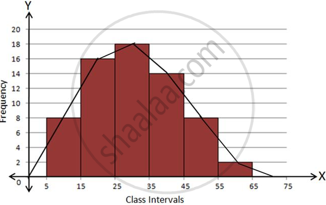
Draw frequency polygons for each of the following frequency distribution:
(a) using histogram
(b) without using histogram
|
C.I |
5 -15 | 15 -25 | 25 -35 | 35 - 45 | 45-55 | 55-65 |
| ƒ | 8 | 16 | 18 | 14 | 8 | 2 |
Advertisements
उत्तर
Using Histogram:
| C.I. | f |
| 5 - 15 | 8 |
| 15 - 25 | 16 |
| 25 - 35 | 18 |
| 35 - 45 | 14 |
| 45 - 55 | 8 |
| 55 - 65 | 2 |
Steps:
- Draw a histogram for the given data.
- Mark the mid-point at the top of each rectangle of the histogram drawn.
- Also, mark the mid-point of the immediately lower class-interval and mid-point of the immediately higher class-interval.
- Join the consecutive mid-points marked by straight lines to obtain the required frequency polygon.
Without using Histogram:
Steps:
- Find the class-mark (mid-value) of each given class-interval.
- On a graph paper, mark class-marks along X-axis and frequencies along Y-axis.
- On this graph paper, mark points taking values of class-marks along the X-axis and the values of their corresponding frequencies along the Y-axis.
- Draw line segments joining the consecutive points marked in step (3) above.
C.I.
Class-mark
f
-5 - 5
0
0
5 - 15
10
8
15 - 25
20
16
25 - 35
30
18
35 - 45
40
14
45 - 55
50
8
55 - 65
60
2
65 - 75
70
0

APPEARS IN
संबंधित प्रश्न
Read the bar graph given in Fig. below and answer the following questions:

(i) What information does it give?
(ii) In which part the expenditure on education is maximum in 1980?
(iii) In which part the expenditure has gone up from 1980 to 1990?
(iv) In which part the gap between 1980 and 1990 is maximum?
The following bar graph shows the results of an annual examination in a secondary school. Read the bar graph and choose the correct alternative in each of the following:

(i) The pair of classes in which the results of boys and girls are inversely proportional are:
(a) VI, VIII (b) VI, IX (c) VIII, IX (d) VIII, X
(ii) The class having the lowest failure rate of girls is
(a) VII (b) X (c) IX (d) VIII
(iii)The class having the lowest pass rate of students is
(a) VI (b) VII (c) VIII (d) IX
The following data gives the production of foodgrains (in thousand tonnes) for some years:
| Year | 1995 | 1996 | 1997 | 1998 | 1999 | 2000 |
| Production (in thousand tonnes |
120 | 150 | 140 | 180 | 170 | 190 |
Represent the above with the help of a bar graph.
In a frequency distribution, ogives are graphical representation of
A histogram is a pictorial representation of the grouped data in which class intervals and frequency are respectively taken along
Construct a combined histogram and frequency polygon for the following frequency distribution:
| Class-Intervals | 10 - 20 | 20 - 30 | 30 - 40 | 40 - 50 | 50 - 60 |
| Frequency | 3 | 5 | 6 | 4 | 2 |
A hundred students from a certain locality use different modes of travelling to school as given below. Draw a bar graph.
| Bus | Car | Rickshaw | Bicycle | Walk |
| 32 | 16 | 24 | 20 | 8 |
The lengths of 62 leaves of a plant are measured in millimetres and the data is represented in the following table:
| Length (in mm) | Number of leaves |
| 118 – 126 | 8 |
| 127 – 135 | 10 |
| 136 – 144 | 12 |
| 145 – 153 | 17 |
| 154 – 162 | 7 |
| 163 – 171 | 5 |
| 172 – 180 | 3 |
Draw a histogram to represent the data above.
The marks obtained (out of 100) by a class of 80 students are given below:
| Marks | Number of students |
| 10 – 20 | 6 |
| 20 – 30 | 17 |
| 30 – 50 | 15 |
| 50 – 70 | 16 |
| 70 – 100 | 26 |
Construct a histogram to represent the data above.
Following table shows a frequency distribution for the speed of cars passing through at a particular spot on a high way:
| Class interval (km/h) | Frequency |
| 30 – 40 | 3 |
| 40 – 50 | 6 |
| 50 – 60 | 25 |
| 60 – 70 | 65 |
| 70 – 80 | 50 |
| 80 – 90 | 28 |
| 90 – 100 | 14 |
Draw the frequency polygon representing the above data without drawing the histogram.
