Advertisements
Advertisements
प्रश्न
Draw a pie chart showing the following information. The table shows the colours preferred by a group of people.
| Colours | Number of people |
| Blue | 18 |
| Green | 9 |
| Red | 6 |
| Yellow | 3 |
| Total | 36 |
Find the proportion of each sector. For example, blue is `18/36 = 1.2` ; green is `9/36 = 1/4` and so on. Use this to find the corresponding angles.
सारिणी
Advertisements
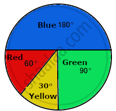
उत्तर
The central angle for each colour can be calculated as follows:
| Colours | Number of people | In fraction | Central angle |
| Blue | 18 | `18/36` | `18/36xx360^@ = 180^@` |
| Green | 9 | `9/36` | `9/36 xx 360^@ = 90^@` |
| Red | 6 | `6/36` | `6/36 xx 360^@ = 60^@` |
| Yellow | 3 | `3/36` | `3/36 xx 360^@ = 30^@` |
| Total | 36 | 360° |
The pie chart of the above data is as follows: 30°
shaalaa.com
क्या इस प्रश्न या उत्तर में कोई त्रुटि है?
