Advertisements
Advertisements
प्रश्न
Draw a frequency polygon for the following data:
| Expenses | 100 - 150 | 150 - 200 | 200 - 250 | 250 - 300 | 300 - 350 | 350 - 400 |
| No. of families | 22 | 37 | 26 | 18 | 10 | 5 |
Advertisements
उत्तर
We take the class limits on the x-axis and the frequencies on the y-axis on suitable scales.
Now, find class marks of all the class intervals. Locate the points (x1, y1) on the graph, where x1 denotes the class mark and y1 denotes the corresponding frequency. Join all the points plotted above with straight line segments. Join the first point and the last point to the points representing class marks of the class intervals before the first class interval and after the last class interval of the given frequency distribution.
Here as the class limits do not start from 0, we put a kink between 0 and the lower boundary of the first class.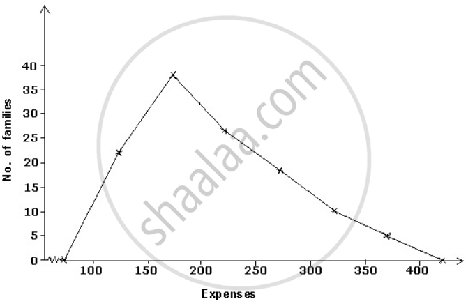
APPEARS IN
संबंधित प्रश्न
The number of students in different sections of class IX of a certain school is given in the following table.
| Section | IX-A | IX-B | IX-C | IX-D | IX-E |
| Number of students | 48 | 40 | 50 | 45 | 38 |
Draw horizontal bar graph for the above data.
Draw a histogram for the following frequency distribution:
| Train fare | 0 - 50 | 50 - 100 | 100 - 150 | 150 - 200 | 200 - 250 | 250 - 300 |
| No. of travellers | 25 | 40 | 36 | 20 | 17 | 12 |
The following frequency distribution table shows the cost of living in a city in a period of 2years. Draw histogram for this frequency distribution:
| Cost of living | 2000 - 2500 | 2500 - 3000 | 3000 - 3500 | 3500 - 4000 | 4000 - 4500 | 4500 - 5000 | 5000 - 5500 | 5500 - 6000 |
| No. of months | 3 | 4 | 2 | 5 | 3 | 2 | 4 | 1 |
Draw a histogram for the following frequency table:
| Class interval | 5 - 9 | 10 - 14 | 15 - 19 | 20 - 24 | 25 - 29 | 30 - 34 |
| Frequency | 5 | 9 | 12 | 10 | 16 | 12 |
Draw a histogram for the following cumulative frequency table:
| Marks | Less than 10 | Less than 20 | Less than 30 | Less than 40 | Less than 50 | Less than 60 |
| Number of student | 7 | 18 | 30 | 45 | 55 | 60 |
Draw a histogram for the following cumulative frequency table:
| Class interval | 0 - 10 | 10 - 20 | 20 - 30 | 30 - 40 | 40 - 50 |
| Cumulative frequency | 6 | 10 | 18 | 32 | 40 |
Draw a histogram and a frequency polygon for the following data:
| Marks | 0 - 20 | 20 - 40 | 40 - 60 | 60 - 80 | 80 - 100 |
| No. of students | 12 | 18 | 30 | 25 | 15 |
Draw a histogram and a frequency polygon for the following data:
| Wages | 150 - 200 | 200 - 250 | 250 - 300 | 300 - 350 | 350 - 400 | 400 - 450 |
| No. of workers | 25 | 40 | 35 | 28 | 30 | 22 |
Draw a frequency polygon for the following data:
| Class | 15 - 20 | 20 - 25 | 25 - 30 | 30 - 35 | 35 - 40 | 40 - 45 |
| Frequency | 5 | 12 | 15 | 26 | 18 | 7 |
Draw a frequency polygon for the following data:
| Marks | 5 - 9 | 10 - 14 | 15 - 19 | 20 - 24 | 25 - 29 | 30 - 39 |
| No. of students | 7 | 11 | 15 | 22 | 18 | 5 |
