Advertisements
Advertisements
प्रश्न
Observe the graph given below and answer the question that follow.

- Give a reason to explain if the graph shown above can be a common phenomenon or not. [2]
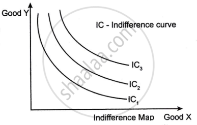
- What is an indifference map? Draw its diagram. [2]
- State any two differences between cardinal utility and ordinal utility. [2]
थोडक्यात उत्तर
Advertisements
उत्तर
- The graph shows an upward-sloping Indifference Curve (IC). This is an unusual phenomenon since an indifference curve exists when there is a "bad" commodity on the X axis and a "good" commodity on the Y axis. The IC slopes upward. Because when consumption of "bad" goods increases, consumption of "good" commodities must also increase in order to maintain the same level of satisfaction.
-
An indifference map is a collection of indifference curves that describe a consumer's preferences for various bundles of commodities about which the consumer is undecided. Each curve on the map represents a combination of commodities that deliver the same amount of satisfaction or utility to the customer. In general, the further a curve goes from its origin, the greater its utility because it contains more of one or both goods.
Cardinal utility Ordinal utility Cardinal utility assumes that utility can be measured in absolute numbers, like 10, 20, 30, etc. Ordinal utility only ranks preferences, like 1st, 2nd or 3rd, without specific numerical values. Cardinal utility is based on the assumption that the satisfaction derived from goods can be quantitatively measured. Ordinal utility only considers that satisfaction can be ordered or ranked but is not quantifiable.
shaalaa.com
या प्रश्नात किंवा उत्तरात काही त्रुटी आहे का?
2023-2024 (March) Official
